Is R turning into an operating system?
Over the years I convinced my colleagues and IT guys that LaTeX/XeLaTeX is the way forward to produce lots of customer reports with individual data, charts, analysis and text. Success! But of course the operating system in the office is still MS Windows.
With my background in Solaris/Linux/Mac OSX I am still a little bit lost in the Windows world, when I have to do such simple tasks as finding and replacing a string in lots of files. Apparently the acronym is FART (find and replace text).
So, what to you do without your beloved command line tools and admin rights? Eventually you start using R instead. So here is my little work-around for replacing "Merry Christmas" with "Happy New Year" in lots of files:
You can find a complete self-contained example on github.
 for( f in filenames ){

  x <- readLines(f)
  y <- gsub( "Merry Christmas", "Happy New Year", x )
  cat(y, file=f, sep="\n")

}
Of course R is not an operating system, but yet it can complement it well, if your other resources are limited.
Last but not least: Happy New Year!
googleVis 0.2.13: new stepped area chart and improved geo charts
On 7th December Google published a new version of their Visualisation API. The new version adds a new chart type: Stepped Area Chart and provides improvements to Geo Chart. Now Geo Chart has similar functionality to Geo Map, but while Geo Map requires Flash, Geo Chart doesn't, as it renders SVG/VML graphics. So it also works on your iOS devices.
These new features have been added to the googleVis R package in version 0.2.13, which went live on CRAN a few days ago.
The function gvisSteppedAreaChart works very much in the same way as gvisAreaChart. Here is a little example:
 library(googleVis)
df <- data.frame(country=c("US", "GB", "BR"),
                 val1=c(1,3,4), val2=c(23,12,32))
SteppedArea <- gvisSteppedAreaChart(df, xvar="country",
                                        yvar=c("val1", "val2"),
                           options=list(isStacked=TRUE,
                                        width=400, height=150))
plot(SteppedArea2)
The interface to gvisGeoChart changed slightly to take into account the new version of Geo Chart by Google. The argument numvar has been renamed to colorvar and a new argument sizevar has been added. This allows you to set the size and colour of the bubbles in displayMode='markers' depending on columns in your data frame. Further, you can set far more options than you could before, in particular you can set not only the region, but also the resolution of your map. Although more granular maps are not available for all countries, for more details see the Google documentation.
Here are two examples, plotting the test data CityPopularity with a Geo Chart.
The first plot shows the popularity of New York, Boston, Miami, Chicago, Los Angeles and Houston on the US map, with the resolution set to 'metros' and region set to 'US'. The Google Map API makes the correct assumption about which cities we mean.
library(googleVis> ## requires googleVis version >= 0.2.13
gcus <- gvisGeoChart(CityPopularity,
        locationvar="City", colorvar="Popularity",
          options=list(displayMode="markers",
                       region="US", resolution="metros"),
         chartid="GeoChart_US")
plot(gcus)
In the second example we set the region to 'US-TX', therefore Google will look for cities with the same names in Texas. And what a surprise, there are cities/towns named Chicago, Los Angeles, Miami, Boston and of course Houston in Texas.
gctx <- gvisGeoChart(CityPopularity,
        locationvar="City", colorvar="Popularity",
          options=list(displayMode="markers",
                       region="US-TX", resolution="metros"),
         chartid="GeoChart_TX")
plot(gctx)
With the new version of the Visualisation API Google introduced also the concept of DataTable Roles. This is an interesting idea, as it allows you to add context to the data, similar to the approach used with annotated time lines. Google classifies the DataTable Roles still experimental, but it is a space to watch and ideas on how this could be translated into R will be much appreciated.
And now the news of the googleVis package since version 0.2.10:
Version 0.2.13 [2011-12-19]
==========================

Changes

    o The list of arguments for gvisGeoChart changed:
      - the argument 'numvar' has been renamed to 'colorvar' to
        reflect the updated Google API. Additionally gvisGeoChart
     gained a new argument 'sizevar'.
    o Updated googleVis vignette with a section on using googleVis
      output in presentations
    o Renamed demo EventListner to EventListener

NEW FEATURES

    o Google published a new version of their Visualisation API on 7
      December 2011. Some of the new features have been implemented
      into googleVis already:
      - New stepped area chart function gvisSteppedAreaChart
      - gvisGeoChart has a new marker mode, similar to the mode in
       gvisGeoMap. See example(gvisGeoChart) for the new
        functionalities.

Version 0.2.12 [2011-12-07]
==========================

Bug Fixes

    o gvisMotionChart didn't display data with special characters,
      e.g. spaces, &, %, in column names correctly.
      Thanks to Alexander Holcroft for reporting this issue.

Version 0.2.11 [2011-11-16]
==========================

Changes

   o Updated vignette and documentation with instructions on changing
     the Flash security settings to display Flash charts locally.
     Thanks to Tony Breyal.
   o New example to plot weekly data with gvisMotionChart
   o Removed local copies of gadget files to reduce package file
     size. A local copy of the R script to generate the original gadget
     files is still included in inst/gadgets

Version 0.2.10 [2011-09-24]
==========================

Changes

   o Updated section 'Using googleVis output with Google Sites,
     Blogger, etc.' vignette

   o Updated example for gvisMotionChart, showing how the initial
     chart setting can be changed, e.g to display a line chart.

   o New example for gvisAnnotatedTimeLine, showing how to shade
     areas. Thanks to Mike Silberbauer for providing the initial code.

NEW FEATURES

    o New demo WorldBank. It demonstrates how country level data can
      be accessed from the World Bank via their API and displayed with a
      Motion Chart. Inspired by Google's Public Data Explorer, see
      http://www.google.com/publicdata/home
Data is the new gold
Life should become easier for data journalists, as the Guardian, one of the data journalism pioneers, points out in this article about the new open data initiative of the European Union (EU). The aims of the EU's open data strategy are bold. Data is seen as the new gold of the digital age. The EU is estimating that public data is already generating economic value of €32bn each year, with growth potential to €70bn, if more data will be made available. Here is the link to the press statement, which I highly recommend reading:
EUROPA - Press Releases - Neelie Kroes Vice-President of the European Commission responsible for the Digital Agenda, Data is the new gold, Opening Remarks, Press Conference on Open Data Strategy Brussels, 12th December 2011
I am particularly impressed that the EU even aims to harmonise the way data will be published by the various bodies. We know that working with data, open or proprietary, often means spending a lot of time on cleaning, reshaping and transforming it, in order to join it with other sources and to make sense out of it.
Data standards would really help in this respect. And the EU is pushing this as well. I can observe this in the insurance industry already, where new European regulatory requirements (Solvency II) force companies to increase their data management capabilities. This is often a huge investment and has to be seen as a long term project.
Although the press statement doesn't mention anything about open source software projects, I think that they are essential for unfolding the full potential of open data.
Open source projects like R provide a platform to share new ideas. I'd say that R, but equally other languages as well, provide interfaces between minds and hands. Packages, libraries, etc. make it possible to spread ideas and knowledge. Having access to scientific papers is great but being able to test the ideas in practice accelerates the time it takes to embed new developments from academia into the business world.
LondonR, 6 December 2011

However, it were the speakers and their talks which attracted me:
- James Long: Easy Parallel Stochastic Simulations using Amazon's EC2 & Segue
- Chibisi Chima-Okereke: Actuarial Pricing Using General Linear Models In R
- Richard Saldanha: Practical Optimisation
Fitting distributions with R
A good starting point to learn more about distribution fitting with R is Vito Ricci's tutorial on CRAN. I also find the vignettes of the actuar and fitdistrplus package a good read. I haven't looked into the recently published Handbook of fitting statistical distributions with R, by Z. Karian and E.J. Dudewicz, but it might be worthwhile in certain cases, see Xi'An's review. A more comprehensive overview of the various R packages is given by the CRAN Task View: Probability Distributions, maintained by Christophe Dutang.
How do I decide which distribution might be a good starting point?
I came across the paper Probabilistic approaches to risk by Aswath Damodaran. In Appendix 6.1 Aswath discusses the key characteristics of the most common distributions and in Figure 6A.15 he provides a decision tree diagram for choosing a distribution:
 |
Figure 6A.15 from Probabilistic approaches to risk by Aswath Damodaran |
JD Long points to the Clickable diagram of distribution relationships by John Cook in his blog entry about Fitting distribution X to data from distribution Y . With those two charts I find it not too difficult anymore to find a reasonable starting point.
Once I have decided which distribution might be a good fit I start usually with the
fitdistr function of the MASS package. However, since I discovered the fitdistrplus package I have become very fond of the fitdist function, as it comes with a wonderful plot method. It plots an empirical histogram with a theoretical density curve, a QQ and PP-plot and the empirical cumulative distribution with the theoretical distribution. Further, the package provides also goodness of fit tests via gofstat.Suppose I have only 50 data points, of which I believe that they follow a log-normal distribution. How much variance can I expect? Well, let's experiment. I draw 50 random numbers from a log-normal distribution, fit the distribution to the sample data and repeat the exercise 50 times and plot the results using the plot function of the fitdistrplus package.

I notice quite a big variance in the results. For some samples other distributions, e.g. logistic, could provide a better fit. You might argue that 50 data points is not a lot of data, but in real life it often is, and hence this little example already shows me that fitting a distribution to data is not just about applying an algorithm, but requires a sound understanding of the process which generated the data as well.
Interactive presentations with deck.js
The other day I came across a presentation by Christopher Gandrud. Christopher had used deck.js, a JavaScript library for building HTML presentations by Caleb Troughton.
This looked like an interesting approach to me and fortunately the learning curve was not too steep, although I am by no means an html or JavaScript expert. So I created my first deck.js presentation based on the content of previous googleVis presentations. For the first time I can embed videos, Flash and SVG charts without using lots of different apps. I am actually quite pleased by the result, see here: Getting started with googleVis

Stochastic reserving with R: ChainLadder 0.1.5-1 released
ChainLadder package for R. It provides methods which are typically used in insurance claims reserving to forecast future claims payments. |
| Claims development and chain-ladder forecast of the RAA data set using the Mack method |
Initially the package came with implementations of the Mack-, Munich- and Bootstrap Chain-Ladder methods. Since version 0.1.3-3 it also provides general multivariate chain ladder models by Wayne Zhang. Version 0.1.4-0 introduced new functions on loss development factor fitting and Cape Cod by Daniel Murphy following a paper by David Clark. Version 0.1.5-0 has added loss reserving models within the generalized linear model framework following a paper by England P. and Verrall R. (1999) implemented by Wayne Zhang.
For more details see the project web site: http://code.google.com/p/chainladder/ and an early blog entry about R in the insurance industry.
Changes in version 0.1.5-1:
- Internal changes to
plot.MackChainLadderto pass new checks introduced by R 2.14.0.
- Commented out unnecessary creation of 'io' matrix in
ClarkCapeCodfunction. Allows for analysis of very large matrices forCapeCodwithout running out of RAM. 'io' matrix is an integral part ofClarkLDF, and so remains in that function.
-
plot.clarkmethod
- Removed "conclusion" stated in
QQplotof clark methods.
- Restore 'par' settings upon exit
- Slight change to the title
- Removed "conclusion" stated in
- Reduced the minimum 'theta' boundary for weibull growth function
- Added warnings to
as.triangleif origin or dev. period are not numeric
Here is a little example using the googleVis package to display the RAA claims development triangle:
library(ChainLadder)
library(googleVis)
data(RAA) # example data set of the ChainLadder package
class(RAA) <- "matrix" # change the class from triangle to matrix
df <- as.data.frame(t(RAA)) # coerce triangle into a data.frame
names(df) <- 1981 : 1990
df$dev <-  1:10
plot(gvisLineChart(df, "dev", options=list(gvis.editor="Edit me!", hAxis.title="dev. period")))
Installing R 2.14.0 on an iBook G4 running Mac OS 10.4.11

But, R 2.10.1 is a bit dated by now and for the development of my googleVis package I require at least R 2.11.0. So I decided to try installing the most recent version from source, using Xcode 2.5 and TeXLive-2008.
R 2.14.0 is expected to be released on Monday (31st October 2011). The pre-release version is already available on CRAN. I assume that the pre-release version is pretty close to the final version of R 2.14.0, so why wait?
It was actually surprisingly easy to compile the command line version of R from sources. The GUI would be a nice to have, but I am perfectly happy to run R via the Terminal, xterm and Emacs. However, it shouldn't be a surprise that running
configure, make, make install on a 800 Mhz G4 with 640MB memory does take its time. 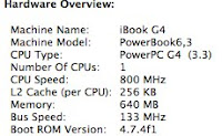
googleVis package.Building R from source on Mac OS 10.4 with Xcode 2.5 (gcc-4.0.1)
Before you start, make sure you have all the Apple Developer Tools installed. I have Xcode installed in
/Developer/Applications.From the pre-release directory on CRAN I downloaded the file R-rc_2011-10-28_r57465.tar.gz.
After I downloaded the file I extracted the archive and run the configure scripts to build the various Makefiles. To do this, I opened the Terminal programme (it's in the Utilities folder of Applications), changed into the directory in which I stored the tar.gz-file and typed:
tar xvfz R-rc_2011-10-28_r57465.tar.gz
cd R-rc
./configure
This process took a little while (about 15 minutes) and at the end I received the following statement:
R is now configured for powerpc-apple-darwin8.11.0

  Source directory:          .
  Installation directory:    /Library/Frameworks

  C compiler:                gcc -std=gnu99  -g -O2
  Fortran 77 compiler:       gfortran  -g -O2

  C++ compiler:              g++  -g -O2
  Fortran 90/95 compiler:    gfortran -g -O2
  Obj-C compiler:            gcc -g -O2 -fobjc-exceptions

  Interfaces supported:      X11, aqua, tcltk
  External libraries:        readline, ICU
  Additional capabilities:   NLS
  Options enabled:           framework, shared BLAS, R profiling, Java

  Recommended packages:      yes
With all the relevant Makefiles in place I could start the build process via:
make -j8Now I had time for a cup of tea, as the build took about one hour. Finally, to finish the installation, I placed the new R version into its place in
/Library/Frameworks/ by typing:sudo make installJob done. Let's test it:
Grappa:~ Markus$ R

R version 2.14.0 RC (2011-10-28 r57465)
Copyright (C) 2011 The R Foundation for Statistical Computing
ISBN 3-900051-07-0
Platform: powerpc-apple-darwin8.11.0 (32-bit)

R is free software and comes with ABSOLUTELY NO WARRANTY.
You are welcome to redistribute it under certain conditions.
Type 'license()' or 'licence()' for distribution details.

  Natural language support but running in an English locale

R is a collaborative project with many contributors.
Type 'contributors()' for more information and
'citation()' on how to cite R or R packages in publications.

Type 'demo()' for some demos, 'help()' for on-line help, or
'help.start()' for an HTML browser interface to help.
Type 'q()' to quit R.

> for(i in 1:8) print("Happy birthday iBook!")
[1] "Happy birthday iBook!"
[1] "Happy birthday iBook!"
[1] "Happy birthday iBook!"
[1] "Happy birthday iBook!"
[1] "Happy birthday iBook!"
[1] "Happy birthday iBook!"
[1] "Happy birthday iBook!"
[1] "Happy birthday iBook!"
The installation of additional packages worked straightforward via
install.packages(c("vector of packages")), though it took time, as everything was build from sources. This it what it looks like on my iBook G4 today:> installed.packages()[,"Version"]
ChainLadder GillespieSSA Hmisc ISOcodes KernSmooth MASS
"0.1.5-0" "0.5-4" "3.8-3" "2011.07.31" "2.23-6" "7.3-16"
Matrix R.methodsS3 R.oo R.rsp R.utils RColorBrewer
"1.0-1" "1.2.1" "1.8.2" "0.6.2" "1.8.5" "1.0-5"
RCurl RJSONIO RUnit Rook XML actuar
"1.6-10" "0.96-0" "0.4.26" "1.0-2" "3.4-3" "1.1-2"
base bitops boot brew car class
"2.14.0" "1.0-4.1" "1.3-3" "1.0-6" "2.0-11" "7.3-3"
cluster coda codetools coin colorspace compiler
"1.14.1" "0.14-4" "0.2-8" "1.0-20" "1.1-0" "2.14.0"
data.table datasets digest flexclust foreign gam
"1.7.1" "2.14.0" "0.5.1" "1.3-2" "0.8-46" "1.04.1"
ggplot2 googleVis grDevices graphics grid iterators
"0.8.9" "0.2.10" "2.14.0" "2.14.0" "2.14.0" "1.0.5"
itertools lattice lmtest mclust methods mgcv
"0.1-1" "0.20-0" "0.9-29" "3.4.10" "2.14.0" "1.7-9"
modeltools mvtnorm nlme nnet parallel party
"0.2-18" "0.9-9991" "3.1-102" "7.3-1" "2.14.0" "0.9-99994"
plyr proto pscl reshape rpart sandwich
"1.6" "0.3-9.2" "1.04.1" "0.8.4" "3.1-50" "2.2-8"
spatial splines statmod stats stats4 strucchange
"7.3-3" "2.14.0" "1.4.13" "2.14.0" "2.14.0" "1.4-6"
survival systemfit tcltk tools utils vcd
"2.36-10" "1.1-8" "2.14.0" "2.14.0" "2.14.0" "1.2-12"
zoo
"1.7-5"
Update (3 June 2012)
Just updated my R installation to R-2.15.0 and the above procedure still worked. But I had to be patient. It took at least an hour to compile R and the core packages.R version 2.15.0 Patched (2012-06-03 r59505) -- "Easter Beagle" Copyright (C) 2012 The R Foundation for Statistical Computing ISBN 3-900051-07-0 Platform: powerpc-apple-darwin8.11.0 (32-bit)
Update (1 June 2013)
Just updated my R installation to R-3.0.1 and the above procedure still worked. The iBook will be 10 years old soon and is still going strong. Not bad for such an old laptop.R version 3.0.1 (2013-05-16) -- "Good Sport" Copyright (C) 2013 The R Foundation for Statistical Computing Platform: powerpc-apple-darwin8.11.0 (32-bit)
Using Sweave with XeLaTeX
pdflatex. Over the last few weeks I have fallen in love with the TeX format XeLaTeX and its XeTeX engine.With XeLaTeX I had to overcome some hurdles, which I would like to share here:
- attaching files,
- trimming and clipping images,
- learning how to use the tikzDevice package.
The Sweave file of the above document is attached to the PDF-file itself, but you can also find it on github: SweaveXeLaTeXExample.Rnw.
R related books: Traditional vs online publishing
A few years ago I used the publication list on r-project.org as an argument with the IT department that R is an established statistical programming language and that they should allow me to install it on my PC. I believe at the time there were about 20 R related books available.
A recent post on Recology pointed me to a talk given by Ed Goodwin at the Houston R user group meeting about regular expressions in R, something I always wanted to learn properly, but never got around to do.
So let's see, if we can manage to extract the information of published R books and texts from r-project.org, with what we learned from Ed about regular expressions in R.
Setting the initial view of a motion chart in R
Over the last couple of weeks I have been asked a view times how to do this. For instance Stephen O'Grady wanted to create a motion chart, which shows initially a line chart, rather than a bubble chart.
Changing the initial settings of a motion chart is actually quite easy, if you know how to. The trick is to use the
state argument in the list of options of gvisMotionChart.As a case study I will use the World Bank data set and try to do some homework given by Duncan Temple Lang in his course on introduction to statistical computing course. Duncan asked his students to query the World Bank data base to create a line chart, which would show the number of internet users per 1000 in Africa over time. Further, he would like to see a legend next to the chart to identify which country is which and tooltips for each curve to identify the country.
A motion chart, displayed as a line chart, would do the trick.
Okay, getting the data is easy, thanks to the WDI package, or via a direct download, and so it is to create a motion chart with bubbles. Interactively I can change the bubble chart into a line chart, I can select some countries and change the y-axis to log-scale. However, when I reload the page I am back to square one: a bubble chart. So the idea is to pass the changed chart settings on to the initial plot. I find those settings, of the current view, as a string in the advanced tab of the settings window. I click on the wrench symbol in the bottom right hand corner of a motion chart to access this window.
 |
| Screen shot the settings window of a motion chart |
Next I copy this string and paste it into the
state argument of the options list. Note the line break at the beginning and at the end of the state string in the example. Alternatively I can add \n to both side of the state string. Here is an example, where I pre-selected Sierra Leone and Seychelles (countries with the lowest and highest number of internet users) together with Africa, North Africa and Sub-Saharan Africa (all income levels). You find the R code below to replicate the plot.
What does the data tell you? Play around with the graph, e.g. change it to a column graph, deselect all countries and change the y-axes to linear again, and hit the play button. How could we improve the plot?
Accessing and plotting World Bank data with R
In this post I will show you how we can access data from the World Bank in R. As an example we create a motion chart, in the Hans Rosling style, as you find it on the Google Public Data Explorer site, which also uses data from the World Bank. Doing this, should give us the confidence that we understand the World Bank's interface. You can find this example as demo
WorldBank as part of the googleVis package from version 0.2.10 onwards.So let's try to replicate the initial plot of the Google Public Data Explorer, which shows fertility rate against life expectancy for each country from 1960 to today, whereby the countries are represented as bubbles, with the size reflecting the population and the colour the region.
R in the insurance industry
 |
| Using R in Insurance |
 |
| Poster session at useR! 2011 in Warwick, UK |
- ChainLadder - Reserving methods in R. The package provides Mack-, Munich-, Bootstrap, and Multivariate-chain-ladder methods, as well as the LDF Curve Fitting methods of Dave Clark and GLM-based reserving models.
- cplm - Monte Carlo EM algorithms and Bayesian methods for fitting Tweedie compound Poisson linear models.
- lossDev - A Bayesian time series loss development model. Features include skewed-t distribution with time-varying scale parameter, Reversible Jump MCMC for determining the functional form of the consumption path, and a structural break in this path.
- actuar: Loss distributions modelling, risk theory (including ruin theory), simulation of compound hierarchical models and credibility theory.
- fitdistrplus: Help to fit of a parametric distribution to non-censored or censored data
- favir: Formatted Actuarial Vignettes in R. FAViR lowers the learning curve of the R environment. It is a series of peer-reviewed Sweave papers that use a consistent style.
- mondate: R packackge to keep track of dates in terms of months
- lifecontingencies - Package to perform actuarial evaluation of life contingencies
- Introduction to R for Actuaries by Nigel de Silva
- An Interactive Introduction To R by Michael Driscoll and Dan Murphy
- If you have trouble with your IT department to get R on your machine this document might help you to put some good arguments forward. The report "An Actuarial Toolkit" was presented at the GIRO convention 2006 in Vienna.
LondonR, 7 September 2011
The first presentation was given by Lisa Wainer from UCL Department of Security and Crime Science about crime data analysis using R. Lisa presented about a project with Merseyside police, where she had built software, in R with the gWidgets package, called the Hot Products Early Warning System, that is used to help understand and characterise the acquisitive crime problem in Merseyside on an ongoing basis, detecting emerging trends in hot products.
Chris Wood gave an insightful talk about his research on sediment biogeochemical modelling in the North Sea. His model uses a set differential equations with over 20 parameters. Chris is able to analyse and fit his model to data he gathered on an expedition in the North Sea using R, the deSolve package and having access to the super-computer at the University of Southampton. How cool is this?
Jean-Robert Avettand-Fenoel talked about the Rook package and how R and Rook has helped him to roll out new applications to his colleagues faster than using Excel, VBA and C++ or RExcel. Rook allows you to build web apps with R. The package is maintained by Jeffery Horner, who also brought us the brew package. The brew allows us, in combination with Rapache, to mix html and R code in the same file. This is quite similar to the approach taken by Sweave for LaTeX and R. However, Rook provides a way to run R web applications on your desktop with the new internal R web server named Rhttpd.
The final presentation was actually given by myself talking about the googleVis package and the recent developments in version 0.2.9:
Including googleVis output in a blogger post
So, I tried to include the output of a googleVis function as a gadget, but also unsuccessfully.
Although you can include gadgets into your site template, it doesn't seem to work with blog posts. So, here is the trick which works for me: the
iframe tag.The following geo map is included as
<iframe width="100%" height="400px" frameborder="0" src="http://dl.dropbox.com/u/7586336/blogger/AndrewGeoMap.html">
</iframe>
As you can see, the chart itself is actually displayed in a page hosted by Dropbox and only inserted into this post via the
iframe-tag.For those of you, who would like to replicate the plot of Hurricane Andrew, here is the R code:
Correction (18 October 2011)
I just figured out that we can actually embed a chart into a blogger post directly. You can literately copy and paste the code directly into the post. However, it doesn't seem to be displayed with MS Internet Explorer.Anyhow, here is the example from above again:
print(AndrewGeoMap, "chart", file="~/Desktop/AndrewGeoMap.js")
Now I copied and pasted the content of that file below:
googleVis 0.2.9
library(XML)
url <- "http://www.warwick.ac.uk/statsdept/useR-2011/participant-list.html"
participants <- readHTMLTable(readLines(url), which=1, stringsAsFactors=F)
names(participants) <- c("Name", "Country", "Organisation")
## Correct typo and shortcut
participants$Country <- gsub("Kngdom","Kingdom",participants$Country)
participants$Country <- gsub("USA","United States",participants$Country)
participants$Country <- factor(participants$Country)
partCountry <- as.data.frame(xtabs( ~ Country, data=participants))
library(googleVis)
## Please note the option gvis.editor requires googleVis version >= 0.2.9
G <- gvisGeoChart(partCountry,"Country", "Freq", options=list(gvis.editor="Edit me") )
plot(G)


1 comment :
Post a Comment