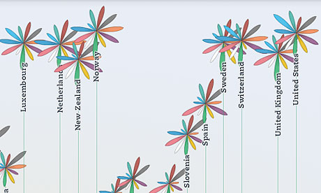
From the Guardian's data blog: Visualising risk
 |
| OECD better life index |
Sweeping through data in R
How do you apply one particular row of your data to all other rows?
Today I came across a data set which showed the revenue split by product and location. The data was formated to show only the split by product for each location and the overall split by location, similar to the example in the table below.
Revenue by product and continent
|
I wanted to understand the revenue split by product and location. Hence, I have to multiply the total split by continent for each product in each column. Or in other words I would like to use the total line and sweep it through my data. Of course there is a function in base R for that. It is called sweep. To my surprise I can't remember that I ever used sweep before. The help page for sweep states that it used to be based on apply, so maybe that's how I would have approached those tasks in the past.
Anyhow, the sweep function requires an array or matrix as an input and not a data frame. Thus let's store the above table in a matrix.
Product <- c("A", "B", "C", "Total")
Continent <- c("Africa", "America", "Asia", "Australia", "Europe")
values <- c(0.4, 0.2, 0.4, 0.1, 0.3, 0.4, 0.3, 0.4, 0.5, 0.2,
            0.3, 0.2, 0.4, 0.3, 0.3, 0.1, 0.4, 0.4, 0.2, 0.2)

M <- matrix(values, ncol=5, dimnames=list(Product, Continent))
Now I can sweep through my data. The arguments for sweep are the data set itself (in my case the first three rows of my matrix), the margin dimension (here 2, as I want to apply the calculations to the second dimension / columns), the summary statistics to be applied (in my case the totals in row 4) and the function to be applied (in my scenario a simple multiplication "*"):
swept.M <- sweep(M[1:3,], 2, M[4,], "*")
The output is what I desired and can be plotted nicely as a bar plot.
> swept.M
       Continent
Product Africa America Asia Australia Europe
      A   0.04    0.12 0.10      0.04   0.08
      B   0.02    0.16 0.04      0.03   0.08
      C   0.04    0.12 0.06      0.03   0.04

barplot(swept.M*100, legend=dimnames(swept.M)[["Product"]],
       main="Revenue by product and continent",
       ylab="Revenue split %")

One more example
Another classical example for using thesweep function is of course the case when you have revenue information and would like to calculate the income split by product for each location:Revenue <- matrix(1:15, ncol=5)
sweep(Revenue, 2, colSums(Revenue), "/")This is actually the same as prop.table(Revenue, 2), which is short for:
sweep(x, margin, margin.table(x, margin), "/") Reading the help file for margin.table shows that this function is the same as apply(x, margin, sum) and colSum is just a faster version of the same statement.
Review: Kölner R Meeting 30 March 2012
The first Kölner R user meeting was great fun. About 20 useRs had turned up to exchange their ideas, questions and experience with R. Three talks about R & Excel, ggplot2 & XeLaTeX and Dynamical systems with R & simecol had kicked off the evening, with Kölsch (beer) losing our tongues further.
Thankfully a lot of people had brought along their laptops, as unfortunately we lacked a cable to connect any of the computers to the installed projector. Never-mind, we cuddled up around the notebooks and switched slides on the speakers sign.
 |
| Photos: Günter Faes |
Similar to LondonR, it was a very informal event. Maybe slightly forced by myself, as I called everyone by his/her first name, which could be considered rude in Germany. But what I had noticed in London, and the same was true also in Cologne, was that people with a very diverse background and of all ages would meet to discuss matters around R, often not working in the same field. So why worry about hierarchies?
Most attendees were not R experts, but users in its pure sense, trying to solve real life problems, and I suppose that makes those meetings so special. R users are often not programmers by trade, but amateurs, who have a keen interest to extract stories and pictures from their data. And for that reason the discussions are often so engaging. Talking to people using R in social science, psychology, biology, pharma, energy, telcos, finance, insurance or actually statistics opens your mind and eyes. You realise that you are not alone, other people are weird as well. They have similar problems and challenges, but may use a different domain language and look at problems from a different angle. And this can be incredibly refreshing!
Anyhow, we agreed to meet again in about three months time. The pub was a great venue to socialise, yet a bit noisy for the talks. Hopefully we can use a room at the nearby university for the presentations next time. Promises were made already. We shall see. Günter was so kind to set up a mailing list to which you can sign up here. I will continue to use this blog to provide updates on the Cologne R user group in the future and set up a public calendar as well.
Talks
Many thanks to the speakers, who dared to give the first talks and had to improvise on the spot without a projector. Please drop me a line if you would like to speak at one of the next events.
Reminder: Kölner R User Group meets on 30 March 2012

Venue: Sion em Keldenich, Weyertal 47, 50937 Cologne, Germany, 6 p.m., 30 March 2012,
For more details and registration see the Kölner R User Group page.
Copy and paste small data sets into R
How can I embed a small data set into my R code? That was the question I came across today, when I prepared my talk about Dynamical Systems in R with simecol for the forthcoming Cologne R user group meeting.
I wanted to add all the R code of the talk to the last slide. That's easy, but the presentation makes use of a small data set of 3 columns and 21 rows. Surely there must be an elegant solution that I can embed the data into the R code, without writing x <- c(x1, x2,...).
Of course there is a solution, but let's look at the data first. It shows the numbers of trapped lynx and snowshoe hares recorded by the Hudson Bay company in North Canada from 1900 to 1920.
 |
Data sourced from Joseph M. Mahaffy. Original data believed to be published in E. P. Odum (1953), Fundamentals of Ecology, Philadelphia, W. B. Saunders. Another source with data from 1845 to 1935 can be found on D. Hundley's page. |
Logistic map: Feigenbaum diagram in R
The other day I found some old basic code I had written about 15 years ago on a Mac Classic II to plot the Feigenbaum diagram for the logistic map. I remember, it took the little computer the whole night to produce the bifurcation chart.

logistic.map <- function(r, x, N, M){
  ## r: bifurcation parameter
  ## x: initial value
  ## N: number of iteration
  ## M: number of iteration points to be returned
  z <- 1:N
  z[1] <- x
  for(i in c(1:(N-1))){
    z[i+1] <- r *z[i]  * (1 - z[i])
  }
  ## Return the last M iterations
  z[c((N-M):N)]
}

## Set scanning range for bifurcation parameter r
my.r <- seq(2.5, 4, by=0.003)
system.time(Orbit <- sapply(my.r, logistic.map,  x=0.1, N=1000, M=300))
##   user  system elapsed (on a 2.4GHz Core2Duo)
##   2.910   0.018   2.919

Orbit <- as.vector(Orbit)
r <- sort(rep(my.r, 301))

plot(Orbit ~ r, pch=".")
Let's not forget when Mitchell Feigenbaum started this work in 1975 he did this on his little calculator!
Update, 18 March 2012
The comment from Berend has helped to speedup the code by a factor of about four, thanks to byte compiling (using the same parameters as above), and Owe got me thinking about the alpha value of the plotting colour. Here is the updated result, with the R code below:

library(compiler) ## requires R >= 2.13.0
logistic.map <- cmpfun(logistic.map) # same function as above
my.r <- seq(2.5, 4, by=0.001)
N <- 2000; M <- 500; start.x <- 0.1
orbit <- sapply(my.r, logistic.map,  x=start.x, N=N, M=M)
Orbit <- as.vector(orbit)
r <- sort(rep(my.r, (M+1)))
plot(Orbit ~ r, pch=".", col=rgb(0,0,0,0.05))
Changes in life expectancy animated with geo charts
The data of the World Bank is absolutely amazing. I had said this before, but their updated iPhone App gives me a reason to return to this topic. Version 3 of the DataFinder App allows you to visualise the data on your phone, including motion maps, see the screen shot below.
 |
| Screen shot of DataFinder 3.0 |
I was intrigued by the by the changes in life expectancy over time around the world. The average life expectancy of a new born baby in 1960 was only 52.6 years, and don't forget we are in 2012, 52 years later. Babies born in 2009 can expect to live to the age 69.4 years, an increase by nearly 17 years or 32%. That is remarkable. But these are average figures and vary a lot by country.
The world bank's online version of the map unfortunately lacks the the animation of the smartphone app. Thus I was keen to find out if I could reproduce something similar in R based on code and ideas provided to me by Manoj Ananthapadmanabhan and Anand Ramalingam last year. Those ideas had helped me to create the animated geo maps demo "AnimatedGeoMap" of the googleVis R package.


