R in Insurance Conference, London, 15 July 2013

The first conference on R in Insurance will be held on Monday 15 July 2013 at Cass Business School in London, UK.
The intended audience of the conference includes both academics and practitioners who are active or interested in the applications of R in insurance.
This one-day conference will focus on applications in insurance and actuarial science that use R, the lingua franca for statistical computation. Topics covered may include actuarial statistics, capital modelling, pricing, reserving, reinsurance and extreme events, portfolio allocation, advanced risk tools, high-performance computing, econometrics and more. All topics will be discussed within the context of using R as a primary tool for insurance risk management, analysis and modelling.
The intended audience of the conference includes both academics and practitioners who are active or interested in the applications of R in insurance.
The 2013 R in Insurance conference builds upon the success of the R in Finance and R/Rmetrics events. We expect invited keynote lectures by:
- Professor Alexander McNeil, Department of Actuarial Science & Statistics
Heriot-Watt University - Trevor Maynard, Head of Exposure Management and Reinsurance, Lloyd's
Details about the registration and abstract submission are given on the R in Insurance event web site of Cass Business School.
You can contact us via rinsuranceconference at gmail dot com.
The organisers, Andreas Tsanakas and Markus Gesmann, gratefully acknowledge the sponsorship of Mango Solutions.
2013
,
Cass Business School
,
Conference
,
Insurance
,
R
,
R in Insurance
Now I see it! K-means cluster analysis in R
Of course, a picture on a computer monitor is a coloured plot of x and y coordinates or pixels. Still, I was smitten by David Sparks' posts on is.r(), where he shows how easy it is to read images into R to analyse them. In two posts [1], [2] he replicates functionality of image manipulation programmes like GIMP.
I can't resist to write about this here as well. David's first post is about k-means cluster analysis. One of the popular algorithms for k-means is Lloyd's algorithm. So, on that note I will use a picture of the Lloyd's of London building to play around with David's code, despite the fact that the two Lloyd have nothing to do with each other. Lloyd's provides pictures of its building copyright free on its web site. However, I will use a reduced file size version, which I copied to GitHub.
The jpeg package by Simon Urbanek [3] allows me to load a jpeg-file into R. The R object of the images is an array, which has the structure of three layered matrices, representing the value of the colours red, green and blue for each x and y coordinate. I convert the array into a data frame, as this is an accepted structure by k-means and plot the data.

Running a k-means analysis on the three colour columns in my data frame allows me to reduce the picture to k colours. The output gives me for each x and y coordinate the colour cluster it belongs to. Thus, I plot my picture again, but replace the original colours with the cluster colours.
I can't resist to write about this here as well. David's first post is about k-means cluster analysis. One of the popular algorithms for k-means is Lloyd's algorithm. So, on that note I will use a picture of the Lloyd's of London building to play around with David's code, despite the fact that the two Lloyd have nothing to do with each other. Lloyd's provides pictures of its building copyright free on its web site. However, I will use a reduced file size version, which I copied to GitHub.
The jpeg package by Simon Urbanek [3] allows me to load a jpeg-file into R. The R object of the images is an array, which has the structure of three layered matrices, representing the value of the colours red, green and blue for each x and y coordinate. I convert the array into a data frame, as this is an accepted structure by k-means and plot the data.
library(jpeg)
library(RCurl)
url <-"https://raw.githubusercontent.com/mages/diesunddas/master/Blog/LloydsBuilding.jpg"
readImage <- readJPEG(getURLContent(url, binary=TRUE))
dm <- dim(readImage)
rgbImage <- data.frame(
                    x=rep(1:dm[2], each=dm[1]),
                    y=rep(dm[1]:1, dm[2]),
                    r.value=as.vector(readImage[,,1]),
                    g.value=as.vector(readImage[,,2]),
                    b.value=as.vector(readImage[,,3]))

plot(y ~ x, data=rgbImage, main="Lloyd's building",
     col = rgb(rgbImage[c("r.value", "g.value", "b.value")]),
     asp = 1, pch = ".")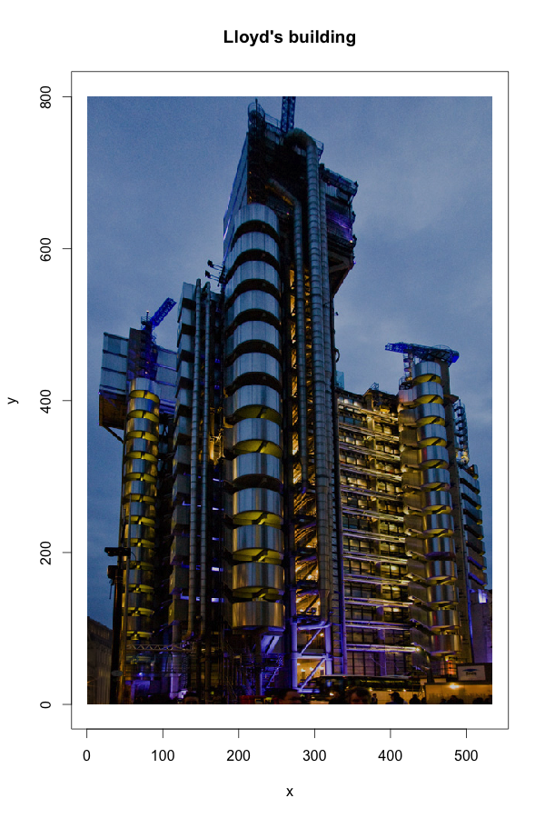
Running a k-means analysis on the three colour columns in my data frame allows me to reduce the picture to k colours. The output gives me for each x and y coordinate the colour cluster it belongs to. Thus, I plot my picture again, but replace the original colours with the cluster colours.
cluster analysis
,
image manipulation
,
k-means
,
Lloyd's
,
R
,
voronoi
Comparing regions: maps, cartograms and tree maps
Last week I attended a seminar where a talk was given about the economic opportunities in the SAAAME (South-America, Asia, Africa and Middle East) regions. Of course a map was shown with those regions highlighted. The map was not that disimilar to the one below.

Greenland appears to be of the same size as Brazil or Australia and Africa seems to be only about four times as big as Greenland. Of course this is not true. Africa is about 14 times the size of Greenland, while Brazil and Australia are about four times the size of Greenland, with Brazil slightly larger than Australia and nine times the population. Thus, talking about regional opportunities without a comparable scale can give a misleading picture.
Of course you can use a different projection and XKCD helps you to find one which fits your personality. On the other hand, Michael Gastner and Mark Newman developed cartograms, which can reshape the world based on data [1]. Doing this in R is a bit tricky. Duncan Temple Lang provides the Rcartogram package on Omegahat based on Mark Newman's code and Mark Ward has some examples using the package on his 2009 fall course page to get you started.
A simple example of a cartogram is given as part of the maps package. It shows the US population by state:

library(RColorBrewer)
library(rworldmap)
data(countryExData)
par(mai=c(0,0,0.2,0),xaxs="i",yaxs="i")
mapByRegion( countryExData,
             nameDataColumn="GDP_capita.MRYA",
             joinCode="ISO3", nameJoinColumn="ISO3V10",
             regionType="Stern", mapTitle=" ", addLegend=FALSE,
FUN="mean", colourPalette=brewer.pal(6, "Blues"))Greenland appears to be of the same size as Brazil or Australia and Africa seems to be only about four times as big as Greenland. Of course this is not true. Africa is about 14 times the size of Greenland, while Brazil and Australia are about four times the size of Greenland, with Brazil slightly larger than Australia and nine times the population. Thus, talking about regional opportunities without a comparable scale can give a misleading picture.
Of course you can use a different projection and XKCD helps you to find one which fits your personality. On the other hand, Michael Gastner and Mark Newman developed cartograms, which can reshape the world based on data [1]. Doing this in R is a bit tricky. Duncan Temple Lang provides the Rcartogram package on Omegahat based on Mark Newman's code and Mark Ward has some examples using the package on his 2009 fall course page to get you started.
A simple example of a cartogram is given as part of the maps package. It shows the US population by state:
Changing colours and legends in lattice plots
Lattice plots are a great way of displaying multivariate data in R. Deepayan Sarkar, the author of lattice, has written a fantastic book about Multivariate Data Visualization with R [1]. However, I often have to refer back to the help pages to remind myself how to set and change the legend and how to ensure that the legend will use the same colours as my plot. Thus, I thought I write down an example for future reference.
Eventually I would like to get the following result:

I start with a simple bar chart, using the
Please note that if you use R-2.15.2 or higher you may get a warning message with the current version of lattice (0.20-10), but this is a known issue, and I don't think you need to worry about it.

To change the legend I specify a list with the various options for
Eventually I would like to get the following result:

I start with a simple bar chart, using the
Insurance data set of the MASS package.Please note that if you use R-2.15.2 or higher you may get a warning message with the current version of lattice (0.20-10), but this is a known issue, and I don't think you need to worry about it.
library(MASS)
library(lattice)
## Plot the claims frequency against age group by engine size and district
barchart(Claims/Holders ~ Age | Group, groups=District,
         data=Insurance, origin=0, auto.key=TRUE)
To change the legend I specify a list with the various options for
auto.key. Here I want to set the legend items next to each other, add a title for the legend and change its font size:
Data.table rocks! Data manipulation the fast way in R
I really should make it a habit of using
Here is a simple example: I have a data frame showing incremental claims development by line of business and origin year. Now I would like add a column with the cumulative claims position for each line of business and each origin year along the development years.
It's one line with

And it is getting even better. Suppose you want to get the latest claims development position for each line of business and origin year. Again, it is only one line:
data.table. The speed and simplicity of this R package are astonishing. Here is a simple example: I have a data frame showing incremental claims development by line of business and origin year. Now I would like add a column with the cumulative claims position for each line of business and each origin year along the development years.
It's one line with
data.table! Here it is:myData[order(dev), cvalue:=cumsum(value), by=list(origin, lob)]':=' works by reference and is one of the reasons why data.table is so fast.
And it is getting even better. Suppose you want to get the latest claims development position for each line of business and origin year. Again, it is only one line:
data.table
,
Insurance
,
R
,
Tutorials
Claims reserving in R: ChainLadder 0.1.5-4 released
Last week we released version 0.1.5-4 of the
The chain-ladder method which is a popular method in the insurance industry to forecast future claims payments gave the package its name. However, the
Since we published version 0.1.5-2 in March 2012 additional functionality has been added to the package, see the change log, but in particular the vignette has come a long way.
Many thanks to my co-authors Dan Murphy and Wayne Zhang.
ChainLadder package on CRAN. The R package provides methods which are typically used in insurance claims reserving. If you are new to R or insurance check out my recent talk on Using R in Insurance.The chain-ladder method which is a popular method in the insurance industry to forecast future claims payments gave the package its name. However, the
ChainLadder package has many other reserving methods and models implemented as well, such as the bootstrap model demonstrated below. It is a great starting point to learn more about stochastic reserving.Since we published version 0.1.5-2 in March 2012 additional functionality has been added to the package, see the change log, but in particular the vignette has come a long way.
Many thanks to my co-authors Dan Murphy and Wayne Zhang.
Actuarial
,
ChainLadder
,
Insurance
,
News
,
R
,
reserving
,
stochastic reserving
,
vignette
Simulating neurons or how to solve delay differential equations in R
I discussed earlier how the action potential of a neuron can be modelled via the Hodgkin-Huxely equations. Here I will present a simple model that describes how action potentials can be generated and propagated across neurons. The tricky bit here is that I use delay differential equations (DDE) to take into account the propagation time of the signal across the network.
My model is based on the paper: Epileptiform activity in a neocortical network: a mathematical model by F. Giannakopoulos, U. Bihler, C. Hauptmann and H. J. Luhmann. The article presents a flexible and efficient modelling framework for:
My model is based on the paper: Epileptiform activity in a neocortical network: a mathematical model by F. Giannakopoulos, U. Bihler, C. Hauptmann and H. J. Luhmann. The article presents a flexible and efficient modelling framework for:
- large populations with arbitrary geometry
- different synaptic connections with individual dynamic characteristics
- cell specific axonal dynamics


