How to place titles in lattice plots
latticeExtra package. It produces nice looking charts that mimic the design of the weekly newspaper, such as in this example: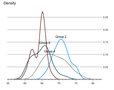
For some time I wondered how I could put the title of my
lattice plots into the top left corner as well (by default titles are centred). Reviewing the code of the theEconomist.theme function by Felix Andrews reveals the trick. It is the setting of par.main.text:library(lattice)
my.settings <- list(
par.main.text = list(font = 2, # make it bold
just = "left",
x = grid::unit(5, "mm")))
xyplot(sin(1:100) ~ cos(1:100),
par.settings=my.settings,
main="Hello World",
type="l")

Furthermore, I can use the same approach to place a sub-title in the bottom left corner of my chart, e.g. to describe the source of my data:
my.settings <- list(
  par.main.text = list(font = 2, # make it bold
                       just = "left",
                       x = grid::unit(5, "mm")),
  par.sub.text = list(font = 1,
                      just = "left",
                      x = grid::unit(5, "mm"))
  )

xyplot(sin(1:100) ~ cos(1:100),
       par.settings=my.settings,
       main="Hello World",
       sub="Source: Nobody knows",
       type="l")

For more information see also the lattice help pages or the lattice book by Deepayan Sarkar: Lattice: Multivariate Data Visualization with R.
Session Info
R version 3.2.0 (2015-04-16)
Platform: x86_64-apple-darwin13.4.0 (64-bit)
Running under: OS X 10.10.3 (Yosemite)

locale:
[1] en_GB.UTF-8/en_GB.UTF-8/en_GB.UTF-8/C/en_GB.UTF-8/en_GB.UTF-8

attached base packages:
[1] stats graphics grDevices utils datasets methods base

other attached packages:
[1] lattice_0.20-31

loaded via a namespace (and not attached):
[1] tools_3.2.0 grid_3.2.0Kalman filter example visualised with R
Over the last week I came across the wonderful quantitative economic modelling site quant-econ.net, designed and written by Thomas J. Sargent and John Stachurski. The site not only provides access to their lecture notes, including the Kalman fitler, but also code in Python and Julia.
I will take their example of the Kalman filter and go through it with R. I particularly liked their visuals of the various steps of the Kalman filter.
Motivation
Suppose I have a little robot that moves autonomously over my desk. How would the robot know where it is? Well, suppose the robot can calculate from its wheels' movements how far it went and an additional sensor (e.g. GPS-like) provides also information about its location. Of course both pieces of information will be imprecise. How can the various signals be combined?This is a classic scenario for the Kalman filter. Its key assumptions are that the errors/noise are Gaussian and that the state space evolution \(x_t\) from one time step to the next is linear, so is the mapping to the sensor signals \(y_t\). For the example I will use it reads:
\[\begin{align}
x_{t+1} & = A x_t + w,\quad w \sim N(0,Q)\\
y_t &=G x_t + \nu, \quad \nu \sim N(0,R)\\
x_1 & \sim N(\hat{x}_0, \Sigma_0)
\end{align}
\]With \(A, Q, G, R, \Sigma\) matrices of appropriate dimensions. The Kalman filter provides recursive estimators for \(x_t\):
\[\begin{align}
K_{t} &= A \Sigma_t G' (G \Sigma_t G' + R)^{-1}\\
\hat{x}_{t+1} &= A \hat{x_t} + K_{t} (y_t - G \hat{x}_t) \\
\Sigma_{t+1} &= A \Sigma_t A' - K_{t} G \Sigma_t A' + Q
\end{align}
\]
Start with a prior
Let's say at time \(t_0\) the robot has the expected position \(\hat{x} = (0.2, -0.2)\). That means, the robot doesn't know its location on the table with certainty. Further I shall assume that the probability density function of the position follows a Normal distribution with covariance matrix \(\Sigma = \left[\begin{array}{cc}0.4 & 0.3\\
0.3 & 0.45
\end{array}
\right]
\)
The prior distribution of the robot's position can be visualised in R with a contour plot.

library(mnormt)
xhat <- c(0.2, -0.2)
Sigma <- matrix(c(0.4, 0.3,
                  0.3, 0.45), ncol=2)
x1 <- seq(-2, 4,length=151)
x2 <- seq(-4, 2,length=151)
f <- function(x1,x2, mean=xhat, varcov=Sigma)
  dmnorm(cbind(x1,x2), mean,varcov)
z <- outer(x1,x2, f)
mycols <- topo.colors(100,0.5)
image(x1,x2,z, col=mycols, main="Prior density",
      xlab=expression('x'[1]), ylab=expression('x'[2]))
contour(x1,x2,z, add=TRUE)
points(0.2, -0.2, pch=19)
text(0.1, -0.2, labels = expression(hat(x)), adj = 1)
Sensor information
The 'GPS' sensor provides also data about the location of the robot, again the sensor signal can be regarded as the expected position with some noise. Suppose the reading of the sensor is \(y=(2.3, -1.9)\). I will assume that the sensor signal has an error following a Normal distribution, with a covariance matrix \(R=0.5 \Sigma\).Conceptually I think about it like this, given that the robot is at position \(x\), what would be the likelihood that the sensor reading is \(y\,|\,x\,\)? The Kalman filter assumes a linear mapping from \(x\) to \(y\):
\[y = G x + \nu \mbox{ with } \nu \sim N(0,R)\]In my case \(G\) will be the identity matrix. Let's add the sensor information to the plot.

R <- 0.5 * Sigma
z2 <- outer(x1,x2, f, mean=c(2.3, -1.9), varcov=R)
image(x1, x2, z2, col=mycols, main="Sensor density")
contour(x1, x2, z2, add=TRUE)
points(2.3, -1.9, pch=19)
text(2.2, -1.9, labels = "y", adj = 1)
contour(x1, x2,z, add=TRUE)
points(0.2, -0.2, pch=19)
text(0.1, -0.2, labels = expression(hat(x)), adj = 1)
Filtering
I have two pieces of information about the location of the robot, both with a Normal distribution, my prior is \( x \sim N(\hat{x},\Sigma)\) and for the distribution of my sensor I have \(y\,|\,x \sim N(Gx, R)\).What I would like to know is the location of the robot given the sensor reading:
\[p(x \,|\, y) = \frac{p(y \,|\, x) \, p(x)} {p(y)}\]Now, because \(x, y\) are Normal and \(G\) is the identity matrix, I know that the posterior distribution of \(x \,|\, y\) is Normal again, with parameters (see conjugate prior):
\[
\hat{x}_f = (\Sigma^{-1} + R^{-1})^{-1} (\Sigma^{-1} \hat{x} + R^{-1} y) \\
\Sigma_f = (\Sigma^{-1} + R^{-1})^{-1}\]Using the matrix inversion identity \[(A^{-1} + B^{-1})^{-1} = A - A (A + B)^{-1}A = A (A + B)^{-1} B \] I can write the above as:
\[
\begin{align}
\hat{x}_f & = (\Sigma - \Sigma (\Sigma + R)^{-1}\Sigma)(\Sigma^{-1} \hat{x} + R^{-1}y)\\
& =\hat{x} - \Sigma (\Sigma + R)^{-1} \hat{x} + \Sigma R^{-1} y -\Sigma (\Sigma + R)^{-1}\Sigma R^{-1}y\\
& = \hat{x} + \Sigma (\Sigma + R)^{-1} (y - \hat{x})\\
& = (1.667, -1.333)\\
\Sigma_f &= \Sigma - \Sigma (\Sigma + R)^{-1} \Sigma\\
&=\left[\begin{array}{lll}
0.133 & 0.10\\
0.100 & 0.15
\end{array}
\right]
\end{align}
\]In the more general case when \(G\) is not the identity matrix I have
\[
\begin{align}
\hat{x}_f & = \hat{x} + \Sigma G' (G \Sigma G' + R)^{-1} (y - G \hat{x})\\
\Sigma_f &= \Sigma - \Sigma G' (G \Sigma G' + R)^{-1} G \Sigma
\end{align}
\]The updated posterior probability density function \(p(x\,|\,y)=N(\hat{x}_f, \Sigma_f)\) is visualised in the chart below.

G = diag(2)
y <- c(2.4, -1.9)
xhatf <- xhat + Sigma %*% t(G) %*% solve(G %*% Sigma %*% t(G) + R) %*% (y - G %*% xhat)
Sigmaf <- Sigma - Sigma %*% t(G) %*% solve(G %*% Sigma %*% t(G) + R) %*% G %*% Sigma
z3 <- outer(x1, x2, f, mean=c(xhatf), varcov=Sigmaf)
image(x1, x2, z3, col=mycols,
      xlab=expression('x'[1]), ylab=expression('x'[2]),
      main="Filtered density")
contour(x1, x2, z3, add=TRUE)
points(xhatf[1], xhatf[2], pch=19)
text(xhatf[1]-0.1, xhatf[2],
     labels = expression(hat(x)[f]), adj = 1)
lb <- adjustcolor("black", alpha=0.5)
contour(x1, x2, z, add=TRUE, col=lb)
points(0.2, -0.2, pch=19, col=lb)
text(0.1, -0.2, labels = expression(hat(x)), adj = 1, col=lb)
contour(x1, x2, z2, add=TRUE, col=lb)
points(2.3, -1.9, pch=19, col=lb)
text(2.2, -1.9,labels = "y", adj = 1, col=lb)
Forecasting
Ok, I have a better understanding of the robot's position at time \(t_0\), but the robot is moving and what I'd like to know is where it will be after one time step.Suppose I have a linear model that explains how the state evolves over time, e.g. based on wheel spin. Again, I will assume a Gaussian process. In this toy example I follow the assumptions of Sargent and Stachurski, although this doesn't make much sense for the robot:
\[
x_{t+1} = A x_t + w_{t+1} \mbox{, where } w_t \sim N(0, Q)
\]with\[
\begin{split}A
= \left(
\begin{array}{cc}
1.2 & 0.0 \\
0.0 & -0.2
\end{array}
\right),
\qquad
Q = 0.3 \Sigma\end{split}
\]As all the processes are linear and Normal the calculations are straightforward:
\[
\begin{align}
\mathbb{E} [A x_f + w] &= A \mathbb{E} [x_f] + \mathbb{E} [w]\\
&= A \hat{x}_f\\
&= A \hat{x} + A \Sigma G' (G \Sigma G' + R)^{-1}(y - G \hat x)
\end{align}\]\[
\begin{align}
\operatorname{Var} [A x_f + w] &= A \operatorname{Var}[x_f] A' + Q\\
&= A \Sigma_f A' + Q\\
&= A \Sigma A' - A \Sigma G' (G \Sigma G' + R)^{-1} G \Sigma A' + Q
\end{align}
\]The matrix \(A \Sigma G' (G \Sigma G' + R)^{-1}\) is often written as \(K_\Sigma\) and called the Kalman gain. Using this notation, I can summarise the results as follows:\[
\begin{split}\begin{align}
\hat{x}_{new} &:= A \hat{x} + K_{\Sigma} (y - G \hat{x}) \\
\Sigma_{new} &:= A \Sigma A' - K_{\Sigma} G \Sigma A' + Q \nonumber
\end{align}\end{split}
\]Adding the prediction to my chart gives me:

A <- matrix(c(1.2, 0,
              0, -0.2), ncol=2)
Q <- 0.3 * Sigma
K <- A %*% Sigma %*% t(G) %*% solve(G%*% Sigma %*% t(G) + R)
xhatnew <- A %*% xhat + K %*% (y - G %*% xhat)
Sigmanew <- A %*% Sigma %*% t(A) - K %*% G %*% Sigma %*% t(A) + Q
z4 <- outer(x1,x2, f, mean=c(xhatnew), varcov=Sigmanew)
image(x1, x2, z4, col=mycols,
      xlab=expression('x'[1]), ylab=expression('x'[2]),
      main="Predictive density")
contour(x1, x2, z4, add=TRUE)
points(xhatnew[1], xhatnew[2], pch=19)
text(xhatnew[1]-0.1, xhatnew[2],
     labels = expression(hat(x)[new]), adj = 1)
contour(x1, x2, z3, add=TRUE, col=lb)
points(xhatf[1], xhatf[2], pch=19, col=lb)
text(xhatf[1]-0.1, xhatf[2], col=lb,
     labels = expression(hat(x)[f]), adj = 1)
contour(x1, x2, z, add=TRUE, col=lb)
points(0.2, -0.2, pch=19, col=lb)
text(0.1, -0.2, labels = expression(hat(x)), adj = 1, col=lb)
contour(x1, x2, z2, add=TRUE, col=lb)
points(2.3, -1.9, pch=19, col=lb)
text(2.2, -1.9,labels = "y", adj = 1, col=lb)Another way to visualise the four steps can be achieved with the
lattice package:
library(lattice)
grid <- expand.grid(x=x1,y=x2)
grid$Prior <- as.vector(z)
grid$Likelihood <- as.vector(z2)
grid$Posterior <- as.vector(z3)
grid$Predictive <- as.vector(z4)
contourplot(Prior + Likelihood + Posterior + Predictive ~ x*y,
            data=grid, col.regions=mycols, region=TRUE,
            as.table=TRUE,
            xlab=expression(x[1]),
            ylab=expression(x[2]),
            main="Kalman Filter",
            panel=function(x,y,...){
              panel.grid(h=-1, v=-1)
              panel.contourplot(x,y,...)
            })
You can find the code of this post on Github.
Session Info
R version 3.1.2 (2014-10-31)
Platform: x86_64-apple-darwin13.4.0 (64-bit)

locale:
[1] en_GB.UTF-8/en_GB.UTF-8/en_GB.UTF-8/C/en_GB.UTF-8/en_GB.UTF-8

attached base packages:
[1] stats graphics grDevices utils datasets methods base

other attached packages:
[1] lattice_0.20-29 mnormt_1.5-1

loaded via a namespace (and not attached):
[1] grid_3.1.2 tools_3.1.2The joy of joining data.tables
data.table in R. Mapping old data to new data
Categories in general are never fixed, they always change at some point. And then the trouble starts with the data. For example not that long ago we didn't distinguish between smartphones and dumbphones, or video on demand and video rental shops.I would like to back track price change data for smartphones and online movie rental shops, assuming that their earlier development can be set to the categories they were formerly part of, namely mobile and video rental shops to create indices.
Here is my toy data:

I'd like to create price indices for all products and where data for the new product categories is missing, use the price changes of the old product category.

The
data.table package helps here. I start with my original data, convert it into a data.table and create mapping tables. That allows me to add the old product with its price change to the new product. The trick here is to set certain columns as key. Two data tables with the same key can easily be joined. Once I have the price changes for products and years the price index can be added. The plot illustrates the result, the R code is below. Adding labels within lattice panels by group
panel.groups is there to help again. Here is my solution:

R code
Using planel.groups in lattice
As part of their talk they had a little competition in visualising London Underground performance data, see their slides. Both made heavy use of the respective panelling / faceting capabilities. Additionally Rich used the
panel.groups argument of xyplot to fine control the content of each panel. Brilliant! I had never used this argument before. So, here is a silly example with the iris data set to remind myself of panel.groups in the future.
Changing colours and legends in lattice plots
Eventually I would like to get the following result:

I start with a simple bar chart, using the
Insurance data set of the MASS package.Please note that if you use R-2.15.2 or higher you may get a warning message with the current version of lattice (0.20-10), but this is a known issue, and I don't think you need to worry about it.
library(MASS)
library(lattice)
## Plot the claims frequency against age group by engine size and district
barchart(Claims/Holders ~ Age | Group, groups=District,
         data=Insurance, origin=0, auto.key=TRUE)
To change the legend I specify a list with the various options for
auto.key. Here I want to set the legend items next to each other, add a title for the legend and change its font size:
Waterfall charts in style of The Economist with R
Waterfall charts are sometimes quite helpful to illustrate the various moving parts in financial data, in particular when I have positive and negative values like a profit and loss statement (P&L). However, they can be a bit of a pain to produce in Excel. Not so in R, thanks to the waterfall package by James Howard. In combination with the latticeExtra package it is nearly a one-liner to produce a good looking waterfall chart that mimics the look of The Economist:
 |
| Example of a waterfall chart in R |
library(latticeExtra)
library(waterfall)
data(rasiel) # Example data of the waterfall package
rasiel
#    label          value   subtotal
# 1  Net Sales       150    EBIT
# 2  Expenses       -170    EBIT
# 3  Interest         18    Net Income
# 4  Gains            10    Net Income
# 5  Taxes            -2    Net Income

asTheEconomist(
               waterfallchart(value ~ label, data=rasiel,
                              groups=subtotal, main="P&L")
)ggplot2, the Learning R blog has a post on this topic.
The reshape function
The other day I wrote about the R functions by, apply and friends, which allow me to operate on subsets of data. All those functions work nicely, if the data is given in the right format. More often than not it isn't and I have to reshape the data beforehand. Thus, time to discuss the reshape function. I will focus on the reshape function in base R, and not the package of the same name.
I use Fischer's iris data set again, as it is readily available after starting R. The iris data set has 150 observation and the first 6 rows look like this:
head(iris)
  Sepal.Length Sepal.Width Petal.Length Petal.Width Species
1          5.1         3.5          1.4         0.2  setosa
2          4.9         3.0          1.4         0.2  setosa
3          4.7         3.2          1.3         0.2  setosa
4          4.6         3.1          1.5         0.2  setosa
5          5.0         3.6          1.4         0.2  setosa
6          5.4         3.9          1.7         0.4  setosa
I would like to create a box whisker plot, showing the measurements of the observations for each of the species, as in the chart below.


