Show me the data! Or how to digitize plots
I had mentioned the Guardian's data blog and the need for more data journalism earlier here. What I really like about the Guardian's approach in particular is that they share the data of their articles and encourage readers to use it.
Of course there are perfectly valuable reasons for only displaying a chart and not making the underlying data available, e.g. to generate leads, as potential customers may get in touch with you asking for the underlying data, or technology issues that don't allow you to upload data, etc.
I personally believe that when I show a chart I should also make the underlying data available. Pretty pictures give you the attention, but the underlying data will offer you an opportunity to engage with your reader on a different level. This might be similar to open source software. In most cases users don't want to see and read the code, but having the knowledge that they could provides more credibility.
 |
| Screen shot of plot digitizer using Guy Carpenter's global property catastrophe rate on line index |
Here is another reason why I should make the data available: Because it is easy to extract the data from a chart anyhow, thanks to digitizing software like the Java application plot digitizer. While in the past I may have used graph paper and a ruler, nowadays it only takes a few minutes to extract the information.
Big data seminar in London on 1 March 2012
 |
Removable disk packs in 1975. By Eugen Nosko Source: Wikipedia, via Deutsche Fotothek License: CC-BY-SA |
David Chan from City University is organising an interdisciplinary symposium on tackling the ‘Big Data’ challenge on 1 March 2012.
It is an open seminar trying to bring together academics and practitioners from across industry to tackle the challenges posed by "big data" - the growing amount of information that needs to be stored, searched, analysed and visualised in the digital age.
The event will take place in the Oliver Thompson Lecture Theatre, Northampton Square, London EC1V 0HB. Booking is required if you would like to attend. For more details check out the event page.
See you there.
Reshaping the IT world

During my university time I worked on the IT help desk for a while. One day I received a call from a professor, who said that his printer had stopped working. So I asked him, if there was a message on the display and if he could read it to me. "Oh yes", he said, "it says: 'Load A4 paper.'"
Rachel King quotes a study by Cisco on ZDnet, which believes to have found out that college students and young employees under the age of 30 would rather take a lower salary than having no social media freedom, device flexibility and work mobility.
It feels like the 1960's in a lot of offices and IT departments of today. A younger generation is demanding more freedom and fun. It just not called rock music, mini skirts or of course the anti baby pill, which the generation of my professor was fighting for. That's all established now. It is the digital equivalent of those rights and I can understand that IT departments are concerned about this.
The reshape function
The other day I wrote about the R functions by, apply and friends, which allow me to operate on subsets of data. All those functions work nicely, if the data is given in the right format. More often than not it isn't and I have to reshape the data beforehand. Thus, time to discuss the reshape function. I will focus on the reshape function in base R, and not the package of the same name.
I use Fischer's iris data set again, as it is readily available after starting R. The iris data set has 150 observation and the first 6 rows look like this:
head(iris)
  Sepal.Length Sepal.Width Petal.Length Petal.Width Species
1          5.1         3.5          1.4         0.2  setosa
2          4.9         3.0          1.4         0.2  setosa
3          4.7         3.2          1.3         0.2  setosa
4          4.6         3.1          1.5         0.2  setosa
5          5.0         3.6          1.4         0.2  setosa
6          5.4         3.9          1.7         0.4  setosa
I would like to create a box whisker plot, showing the measurements of the observations for each of the species, as in the chart below.
googleVis 0.2.14 is released
Version 0.2.14 of the googleVis package was released on CRAN today.
Changes
The help files have been checked against changes of the Google Visualisation API, typos in the vignette have been ironed out (thanks to Pat Burns for pointing them out), a new section on dealing with apostrophes in column names has been added and the example in the section "Setting options" has been reviewed. For more details and demos check out the project site.
New Feature
Additionally a new visualisation function has been added: gvisBubbleChart, which provides an interface to the bubble chart of the Google Visualisation API. You could think of it as a static version of the motion chart. Here are some examples, followed by a motion chart.
library(googleVis)
data(Fruits)

P <- lapply(2008:2010, function(x)
      gvisBubbleChart(subset(Fruits, Year %in% x), idvar="Fruit",
       xvar="Sales", yvar="Expenses",
       colorvar="Location", sizevar="Profit",
       options=list(width=400, height=300,
        colors='["#B2EE2C", "#3F4FFF"]',
        title=paste("Fruit data ",x,", bubble size reflects profit", sep=""),
        sizeAxis="{minValue: 0,  maxSize: 12}",
        vAxis=paste("{title: 'Expenses', viewWindow:{min:65, max:95},",
             "baselineColor:'#EEEEEE', gridlines:{color:'#EEEEEE'}}"),
        hAxis=paste("{title: 'Sales', viewWindow:{min:70, max:115},",
             "baselineColor:'#EEEEEE', gridlines:{color:'#EEEEEE'}}")
             ))
            )
bubbleCharts <- gvisMerge(P[[1]], gvisMerge(P[[2]], P[[3]]))

M <- gvisMotionChart(Fruits, "Fruit", "Year",
                     options=list(width=430, height=360))
plot(gvisMerge(bubbleCharts, M))
R is the easiest language to speak badly

I am amazed by the number of comments I received on my recent blog entry about "by", "apply" and friends. I had started my post by pointing out that R is a language. Well indeed, I have come to the conclusion, that it is a language with lots of irregular expressions and dialects. It feels a bit like German or French where you have to learn and memorise the different articles. The Germans have three singular definite articles: der (male), die (female) and das (neutral), the French have two: le (male) and la (female). Of course there is no mapping between them, and how do you explain that a girl in German is neutral (das Mädchen), while manhood is female (die Männlichkeit)?
Back to R. As I found out, there are lots of different ways to calculate the means on subsets of data. I begin to wonder, why so many different interfaces and functions have been developed over the years, and also why I didn't use the aggregate function more often in the past?
Can we blame internet search engines? Why should I learn a programming language properly, when I can find approximate answers to my problem online. I may not end up with the best answer, but with something which will work after all: Don't know why, but it works.
And sometimes the help files can be more difficult to understand than the code in the examples. Hence, I end up playing around with the example code until it works, and only then I try to figure out how it works. That was my experience with reshape.
Maybe this is a bit harsh. It is always up to the individual to improve his language skills, but you can get drunk in a pub as well, by only being able to order beer. I think it was George Bernard Shaw, who said: "R is the easiest language to speak badly." No, actually he said: "English is the easiest language to speak badly." Maybe that explains the success of English and R?
Reading helps. More and more books have been published on R over the last years, and not only in English. But which should you pick? Xi'an's review on the Art of R Programming suggests that it might be a good start.
Back to aggregate. Has anyone noticed, that the formula interface of aggregate is different to summaryBy?
aggregate(cbind(Sepal.Width, Petal.Width) ~ Species, data=iris, FUN=mean)
     Species Sepal.Width Petal.Width
1     setosa       3.428       0.246
2 versicolor       2.770       1.326
3  virginica       2.974       2.026
versus
library(doBy)
summaryBy(Sepal.Width + Petal.Width ~ Species, data=iris, FUN=mean)
     Species Sepal.Width.mean Petal.Width.mean
1     setosa            3.428            0.246
2 versicolor            2.770            1.326
3  virginica            2.974            2.026
And another slightly more complex example:
aggregate(cbind(ncases, ncontrols) ~ alcgp + tobgp, data = esoph, FUN=sum)
summaryBy(ncases + ncontrols ~ alcgp + tobgp, data = esoph, FUN=sum)
Say it in R with "by", "apply" and friends
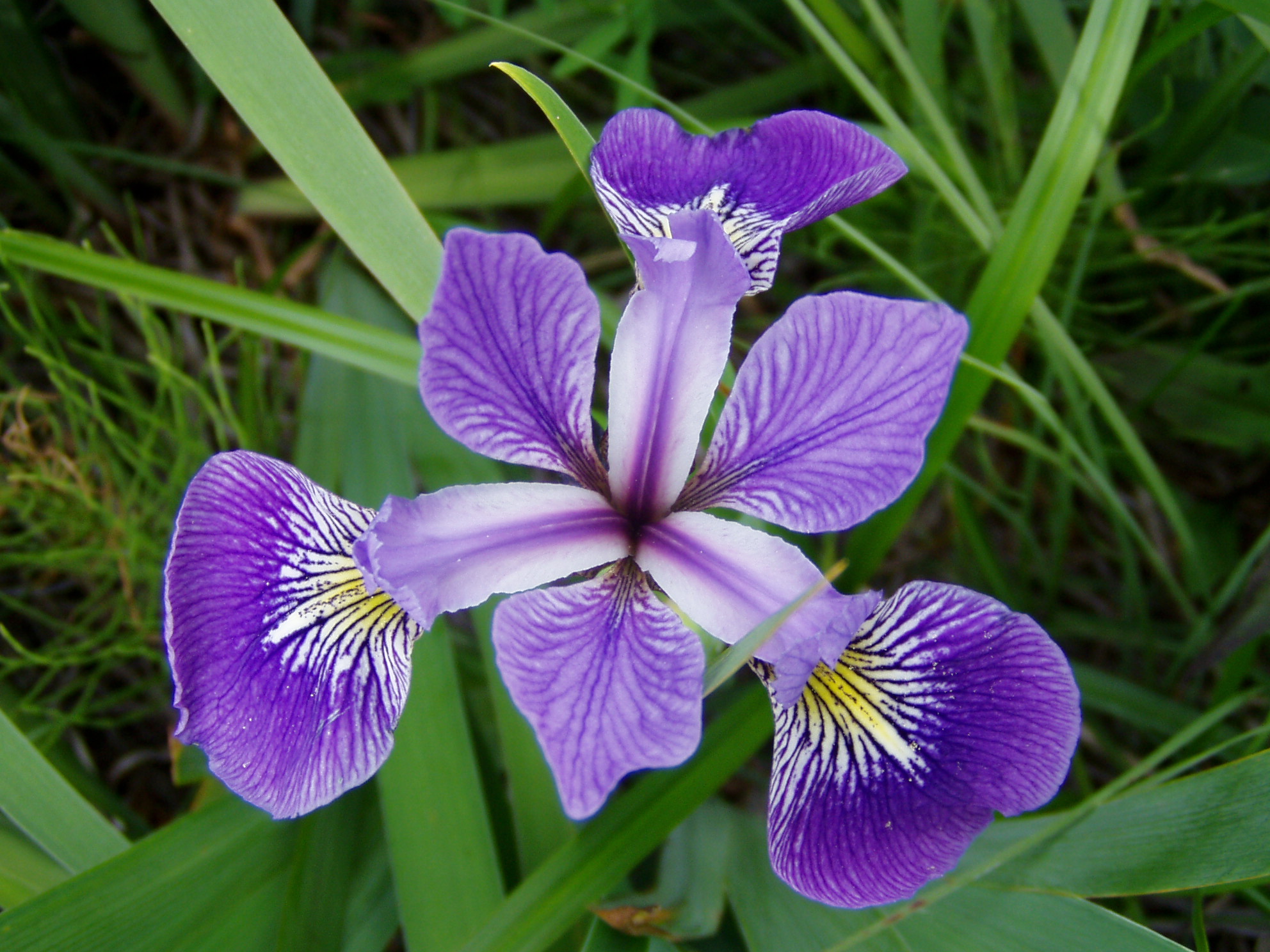 |
| Iris versicolor By Danielle Langlois License: CC-BY-SA |
Languages are full of surprises, in particular for non-native speakers. The other day I learned that there is courtesy and curtsey. Both words sounded very similar to me, but of course created some laughter when I mixed them up in an email.
With languages you can get into habits of using certain words and phrases, but sometimes you see or hear something, which shakes you up again. So did the following two lines in R with me:
f <- function(x) x^2
sapply(1:10, f)
[1]   1   4   9  16  25  36  49  64  81 100
apply family of functions and how little I know about all the subtleties of R.
I remember how happy I felt, when I finally understood the by function in R. I started to use it all the time, closing my eyes on aggregate and the apply functions family. Here is an example where I calculate the means of the various measurements by species of the famous iris data set using by.
by
do.call("rbind", as.list(
  by(iris, list(Species=iris$Species), function(x){
    y <- subset(x, select= -Species)
    apply(y, 2, mean)
  }
)))

           Sepal.Length Sepal.Width Petal.Length Petal.Width
setosa            5.006       3.428        1.462       0.246
versicolor        5.936       2.770        4.260       1.326
virginica         6.588       2.974        5.552       2.026
aggregate, apply, sapply, tapply, data.table, ddply, sqldf, and summaryBy.
aggregate
Theaggregate function splits the data into subsets and computes summary statistics for each of them. The output of aggregate is a data.frame, including a column for species.
iris.x <- subset(iris, select= -Species)
iris.s <- subset(iris, select= Species)
aggregate(iris.x, iris.s, mean)

     Species Sepal.Length Sepal.Width Petal.Length Petal.Width
1     setosa        5.006       3.428        1.462       0.246
2 versicolor        5.936       2.770        4.260       1.326
3  virginica        6.588       2.974        5.552       2.026
Addition: As John Christie points out in the comments, aggregate has also a formula interface, which simplifies the call to:
aggregate( . ~ Species, iris, mean)
apply and tapply
The combination oftapply and apply achieves a similar result, but this time the output is a matrix and hence I lose the column with species. The species are now the row names.
apply(iris.x, 2, function(x) tapply(x, iris.s, mean))

           Sepal.Length Sepal.Width Petal.Length Petal.Width
setosa            5.006       3.428        1.462       0.246
versicolor        5.936       2.770        4.260       1.326
virginica         6.588       2.974        5.552       2.026
split and apply
Here I split the data first into subsets for each of the species and calculate then the mean for each column in the subset. The output is amatrix again, but transposed.
sapply(split(iris.x, iris.s), function(x) apply(x, 2, mean))

             setosa versicolor virginica
Sepal.Length  5.006      5.936     6.588
Sepal.Width   3.428      2.770     2.974
Petal.Length  1.462      4.260     5.552
Petal.Width   0.246      1.326     2.026
ddply
Hadley Wickham'splyr package provides tools for splitting, applying and combining data. The function ddply is similar to the by function, but it returns a data.frame instead of a by list and maintains the column for the species.
library(plyr)
ddply(iris, "Species", function(x){
    y <- subset(x, select= -Species)
    apply(y, 2, mean)
  })

     Species Sepal.Length Sepal.Width Petal.Length Petal.Width
1     setosa        5.006       3.428        1.462       0.246
2 versicolor        5.936       2.770        4.260       1.326
3  virginica        6.588       2.974        5.552       2.026
colMeans function, while Andrew reminds us of the reshape package with its functions melt and cast.
ddply(iris, "Species", function(x) colMeans(subset(x, select= -Species)))
## or
ddply(iris, "Species", colwise(mean))
## same output as above
library(reshape)
cast(melt(iris, id.vars='Species'),formula=Species ~ variable,mean)
## same output as above
summaryBy
ThesummaryBy function of the doBy package by Søren Højsgaard and Ulrich Halekoh has a very intuitive interface, using formulas.
library(doBy)
summaryBy(Sepal.Length + Sepal.Width + Petal.Length + Petal.Width ~ Species, data=iris, FUN=mean)

     Species Sepal.Length.mean Sepal.Width.mean Petal.Length.mean Petal.Width.mean
1     setosa             5.006            3.428             1.462            0.246
2 versicolor             5.936            2.770             4.260            1.326
3  virginica             6.588            2.974             5.552            2.026
sqldf
If you are fluent in SQL, then the sqldf package by Gabor Grothendieck might be the one for you.
library(sqldf)
sqldf("select Species, avg(Sepal_Length), avg(Sepal_Width),
    avg(Petal_Length), avg(Petal_Width) from iris
    group by Species")

     Species avg(Sepal_Length) avg(Sepal_Width) avg(Petal_Length) avg(Petal_Width)
1     setosa             5.006            3.428             1.462            0.246
2 versicolor             5.936            2.770             4.260            1.326
3  virginica             6.588            2.974             5.552            2.026
data.table
Thedata.table package by M Dowle, T Short and S Lianoglou is the real rock star to me. It provides an elegant and fast way to complete the task. The statement reads in plain English from right to left: take columns 1 to 4, split them by the factor in column "Species" and calculate on the sub data (.SD) the means.
library(data.table)
iris.dt <- data.table(iris)
iris.dt[,lapply(.SD,mean),by="Species",.SDcols=1:4]

        Species Sepal.Length Sepal.Width Petal.Length Petal.Width
[1,]     setosa        5.006       3.428        1.462       0.246
[2,] versicolor        5.936       2.770        4.260       1.326
[3,]  virginica        6.588       2.974        5.552       2.026
apply
I should mention that R provides theiris data set also in an array form. The third dimension of the iris3 array holds the species information. Therefore I can use the apply function again, I go down the third and then the second dimension to calculate the means.
apply(iris3, c(3,2), mean)

           Sepal L. Sepal W. Petal L. Petal W.
Setosa        5.006    3.428    1.462    0.246
Versicolor    5.936    2.770    4.260    1.326
Virginica     6.588    2.974    5.552    2.026


