Showing posts with label graphics. Show all posts
Showing posts with label graphics. Show all posts
Using SVG graphics in blog posts
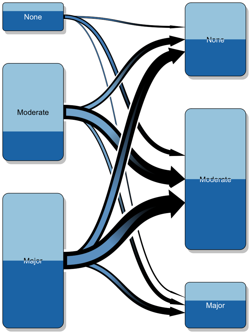
My traditional work flow for embedding R graphics into a blog post has been via a PNG files that I upload online. However, when I created a 'simple' graphic with only basic curves and triangles for a recent post, I noticed that the PNG output didn't look as crisp as I expected it to be. So, eventually I used a SVG (scalable vector graphic) instead.
Creating a SVG file with R could't be easier; e.g. use the
To embed the figure into my page I could use either the traditional
With
There is a little trick required to display a graphic file hosted on GitHub.
By default, when I look for the raw URL, GitHub will provide an address starting with
Ok, let's look at the output. As a nice example plot I use a
Yet, I don't think that SVG is always a good answer. The file size of an SVG file can grow quite quickly, if there are many points to be plotted. As an example check the difference in file size for two identical plots with 10,000 points.
Creating a SVG file with R could't be easier; e.g. use the
svg() function in the same way as png(). Next, make the file available online and embed it into your page. There are many ways to do this, in the example here I placed the file into a public GitHub repository.To embed the figure into my page I could use either the traditional
<img> tag, or perhaps better the <object> tag. Paul Murrell provides further details on his blog.With
<object> my code looks like this:<object data="https://rawgithub.com/mages/diesunddas/master/Blog/transitionPlot.svg" type="image/svg+xml" width="400"> </object>There is a little trick required to display a graphic file hosted on GitHub.
By default, when I look for the raw URL, GitHub will provide an address starting with
https://raw.githubusercontent.com/..., which needs to be replaced with https://rawgithub.com/....Ok, let's look at the output. As a nice example plot I use a
transitionPlot by Max Gordon, something I wanted to do for a long time.SVG output
PNG output
Conclusions
The SVG output is nice and crisp! Zoom in and the quality will not change. The PNG graphic on the other hand appears a little blurry on my screen and even the colours look washed out. Of course, the PNG output could be improved by fiddling with the parameters. But, after all it is a raster graphic.Yet, I don't think that SVG is always a good answer. The file size of an SVG file can grow quite quickly, if there are many points to be plotted. As an example check the difference in file size for two identical plots with 10,000 points.
x <- rnorm(10000)
png()
plot(x)
dev.off()
file.size("Rplot001.png")/1000
# [1] 118.071
svg()
plot(x)
dev.off()
file.size("Rplot001.svg")/1000
# [1] 3099.181
Update 10 Feb 2016
Or, is SVG the answer? Kenton pointed me towards the svglite package.library(svglite)
svglite(file = "Rplot001.svg")
plot(x)
dev.off()
file.size("Rplot001.svg")/1000
# [1] 973.619
gz <- function(in_path, out_path = tempfile()) {
out <- gzfile(out_path, "w")
writeLines(readLines(in_path), out)
close(out)
invisible(out_path)
}
file.size(gz("Rplot001.svg", "Rplot001.svgz")) / 1000
#> [1] 74.11R code
Session Info
R version 3.2.3 (2015-12-10)
Platform: x86_64-apple-darwin13.4.0 (64-bit)
Running under: OS X 10.11.3 (El Capitan)

locale:
[1] en_GB.UTF-8/en_GB.UTF-8/en_GB.UTF-8/C/en_GB.UTF-8/en_GB.UTF-8

attached base packages:
[1] grid      stats     graphics  grDevices utils     datasets
[7] methods   base

other attached packages:
[1] RColorBrewer_1.1-2 Gmisc_1.3          htmlTable_1.5
[4] Rcpp_0.12.3

loaded via a namespace (and not attached):
 [1] Formula_1.2-1       knitr_1.12.3
 [3] cluster_2.0.3       magrittr_1.5
 [5] splines_3.2.3       munsell_0.4.2
 [7] colorspace_1.2-6    lattice_0.20-33
 [9] stringr_1.0.0       plyr_1.8.3
[11] tools_3.2.3         nnet_7.3-12
[13] gtable_0.1.2        latticeExtra_0.6-26
[15] htmltools_0.3       digest_0.6.9
[17] forestplot_1.4      survival_2.38-3
[19] abind_1.4-3         gridExtra_2.0.0
[21] ggplot2_2.0.0       acepack_1.3-3.3
[23] rsconnect_0.3.79    rpart_4.1-10
[25] rmarkdown_0.9.2     stringi_1.0-1
[27] scales_0.3.0        Hmisc_3.17-1
[29] XML_3.98-1.3 foreign_0.8-66Visualising the predictive distribution of a log-transformed linear model
Last week I presented visualisations of theoretical distributions that predict ice cream sales statistics based on linear and generalised linear models, which I introduced in an earlier post.
Today I will take a closer look at the log-transformed linear model and use Stan/rstan, not only to model the sales statistics, but also to generate samples from the posterior predictive distribution.
The posterior predictive distribution is what I am most interested in. From the simulations I can get the 95% prediction interval, which will be slightly wider than the theoretical 95% interval, as it takes into account the parameter uncertainty as well.
Ok, first I take my log-transformed linear model of my earlier post and turn it into a Stan model, including a section to generate output from the posterior predictive distribution.
After I have complied and run the model, I can extract the simulations and calculate various summary statistics. Furthermore, I use my parameters also to predict the median and mean, so that I can compare them against the sample statistics. Note again, that for the mean calculation of the log-normal distribution I have to take into account the variance as well.
Ok, that looks pretty reasonable, and also quite similar to my earlier output with
Just as expected, I note a slightly wider 95% interval range in the posterior predictive distributions compared to the theoretical distributions at the top.
 |
| Theoretical distributions |
The posterior predictive distribution is what I am most interested in. From the simulations I can get the 95% prediction interval, which will be slightly wider than the theoretical 95% interval, as it takes into account the parameter uncertainty as well.
Ok, first I take my log-transformed linear model of my earlier post and turn it into a Stan model, including a section to generate output from the posterior predictive distribution.
After I have complied and run the model, I can extract the simulations and calculate various summary statistics. Furthermore, I use my parameters also to predict the median and mean, so that I can compare them against the sample statistics. Note again, that for the mean calculation of the log-normal distribution I have to take into account the variance as well.
Ok, that looks pretty reasonable, and also quite similar to my earlier output with
glm. Using my plotting function of last week I can also create a nice 3D plot again. |
| Posterior predictive distributions |
Just as expected, I note a slightly wider 95% interval range in the posterior predictive distributions compared to the theoretical distributions at the top.
Session Info
R version 3.2.2 (2015-08-14)
Platform: x86_64-apple-darwin13.4.0 (64-bit)
Running under: OS X 10.10.5 (Yosemite)

locale:
[1] en_GB.UTF-8/en_GB.UTF-8/en_GB.UTF-8/C/en_GB.UTF-8/en_GB.UTF-8

attached base packages:
[1] stats     graphics  grDevices utils datasets
[6] methods   base

other attached packages:
[1] rstan_2.7.0-1 inline_0.3.14 Rcpp_0.12.0

loaded via a namespace (and not attached):
[1] tools_3.2.2 codetools_0.2-14 stats4_3.2.2Visualising theoretical distributions of GLMs
Two weeks ago I discussed various linear and generalised linear models in R using ice cream sales statistics. The data showed not surprisingly that more ice cream was sold at higher temperatures.

I came to the conclusion that I preferred the binomial model for two reasons: the model simulates only whole numbers, just like the observational data and it has natural boundaries defined by zero sales and a market saturation level. Hence, it will neither predict negative sales, nor infinite sales.
However, I didn't review any residual plots or anything else but the mean predictions. So, let's do this in this post.
Arthur Charpentier reminded me via Twitter of an earlier post of his, where he looked at GLMs as well. Arthur used a nice 3D plot to visualise the models. I took his code and wrapped it into a function (it is not pretty, but it will do for now):

The 3D plot shows the observations as circles on the xy-plane, together with the mean predictions as a solid line. In yellow I show the theoretical residual interval between the 5th and 95th quantile of the Normal distributions parametrised by the model output. Additionally I present the density distributions of the model at each observation.
This is conceptually similar to a Q-Q, which compares the standardised residuals with the theoretical quantiles. In the case of a linear model the prediction interval would shrink to the theoretical interval as the number of data points increases.
The 3D plot looks pretty, but I think it is helpful as well. Let me put this in context to the traditional residual plots, see below.
The residual plots identify observations 2, 5 and 10 as extreme points. Indeed, those points are either on the edge or outside (point 10) of the yellow area in the plot above.


Again, the residual plots highlight points 2, 5 and 10 as extremes. I note also from the first residual plot that the log-transformed model over-predicts for colder temperatures.


The same points 2, 5 and 10 are highlighted again as extreme, but now they are well outside the yellow area.


The theoretical range between the 5th and 95th quantile has narrowed further. Data item 10 looks now really suspicious. Observations 2 and 5 are once again highlighted. Now I wonder, is someone eating my ice cream?

icecream <- data.frame(
  temp=c(11.9, 14.2, 15.2, 16.4, 17.2, 18.1,
         18.5, 19.4, 22.1, 22.6, 23.4, 25.1),
  units=c(185L, 215L, 332L, 325L, 408L, 421L,
          406L, 412L, 522L, 445L, 544L, 614L)
)
I came to the conclusion that I preferred the binomial model for two reasons: the model simulates only whole numbers, just like the observational data and it has natural boundaries defined by zero sales and a market saturation level. Hence, it will neither predict negative sales, nor infinite sales.
However, I didn't review any residual plots or anything else but the mean predictions. So, let's do this in this post.
Arthur Charpentier reminded me via Twitter of an earlier post of his, where he looked at GLMs as well. Arthur used a nice 3D plot to visualise the models. I took his code and wrapped it into a function (it is not pretty, but it will do for now):
glmModelPlot <- function(x, y, xlim,ylim, meanPred,  LwPred, UpPred,
                         plotData, main=NULL){
  ## Based on code by Arthur Charpentier:
  ## http://freakonometrics.hypotheses.org/9593
  par(mfrow=c(1,1))
  n <- 2
  N <- length(meanPred)
  zMax <- max(unlist(sapply(plotData, "[[", "z")))*1.5
  mat <- persp(xlim, ylim, matrix(0, n, n), main=main,
               zlim=c(0, zMax), theta=-30,
               ticktype="detailed",box=FALSE)
  C <- trans3d(x, UpPred, rep(0, N),mat)
  lines(C, lty=2)
  C <- trans3d(x, LwPred, rep(0, N), mat)
  lines(C, lty=2)
  C <- trans3d(c(x, rev(x)), c(UpPred, rev(LwPred)),
               rep(0, 2*N), mat)
  polygon(C, border=NA, col=adjustcolor("yellow", alpha.f = 0.5))
  C <- trans3d(x, meanPred, rep(0, N), mat)
  lines(C, lwd=2, col="grey")
  C <- trans3d(x, y, rep(0,N), mat)
  points(C, lwd=2, col="#00526D")
  for(j in N:1){
    xp <- plotData[[j]]$x
    yp <- plotData[[j]]$y
    z0 <- plotData[[j]]$z0
    zp <- plotData[[j]]$z
    C <- trans3d(c(xp, xp), c(yp, rev(yp)), c(zp, z0), mat)
    polygon(C, border=NA, col="light blue", density=40)
    C <- trans3d(xp, yp, z0, mat)
    lines(C, lty=2)
    C <- trans3d(xp, yp, zp, mat)
    lines(C, col=adjustcolor("blue", alpha.f = 0.5))
  }
}
Linear model
I start by plotting the output of the linear model, a GLM assuming a Normal distribution with an identity link function.
The 3D plot shows the observations as circles on the xy-plane, together with the mean predictions as a solid line. In yellow I show the theoretical residual interval between the 5th and 95th quantile of the Normal distributions parametrised by the model output. Additionally I present the density distributions of the model at each observation.
This is conceptually similar to a Q-Q, which compares the standardised residuals with the theoretical quantiles. In the case of a linear model the prediction interval would shrink to the theoretical interval as the number of data points increases.
The 3D plot looks pretty, but I think it is helpful as well. Let me put this in context to the traditional residual plots, see below.
The residual plots identify observations 2, 5 and 10 as extreme points. Indeed, those points are either on the edge or outside (point 10) of the yellow area in the plot above.

xlim <- c(min(icecream$temp)*0.95, max(icecream$temp)*1.05)
ylim <- c(floor(min(icecream$units)*0.95),
          ceiling(max(icecream$units)*1.05))

lin.mod <- glm(units ~ temp, data=icecream,
                   family=gaussian(link="identity"))
par(mfrow=c(2,2))
plot(lin.mod)
title(outer=TRUE, line = -1,
      main = list("Linear regression",
                  cex=1.25,col="black", font=2))

meanPred <- predict(lin.mod, type="response")
sdgig <- sqrt(summary(lin.mod)$dispersion)

UpPred <- qnorm(.95, meanPred, sdgig)
LwPred <- qnorm(.05, meanPred, sdgig)

plotData <- lapply(
seq(along=icecream$temp),
  function(i){
    stp <- 251
    x = rep(icecream$temp[i], stp)
    y = seq(ylim[1], ylim[2], length=stp)
    z0 = rep(0, stp)
    z = dnorm(y, meanPred[i], sdgig)
    return(list(x=x, y=y, z0=z0, z=z))
  }
)

glmModelPlot(x = icecream$temp, y=icecream$units,
             xlim=xlim, ylim=ylim,
             meanPred = meanPred, LwPred = LwPred,
             UpPred = UpPred, plotData = plotData,
             main = "Linear regression")
Log-transformed linear model
The log-transformed model shows an increasing variance around the mean as the temperatures increase. Yet, this shouldn't come as a surprise, as this a property of the log-normal distribution. The variance is given as \(\text{Var}(X) = \exp(2\mu + \sigma^2)(\exp(\sigma^2) - 1) = \text{E}[X]^2 (\exp(\sigma^2) - 1)\) .
Again, the residual plots highlight points 2, 5 and 10 as extremes. I note also from the first residual plot that the log-transformed model over-predicts for colder temperatures.

log.lin.mod <- glm(log(units) ~ temp, data=icecream,
                   family=gaussian(link="identity"))
par(mfrow=c(2,2))
plot(log.lin.mod)
title(outer=TRUE, line = -1,
      main = list("Log-transformed LM",
                  cex=1.25,col="black", font=2))

meanLogPred <- predict(log.lin.mod, type="response")
sdgig <- sqrt(summary(log.lin.mod)$dispersion)

meanPred <- exp(meanLogPred + 0.5 * sdgig^2)
UpPred <- qlnorm(.95, meanlog = meanLogPred, sdlog = sdgig)
LwPred <- qlnorm(.05, meanlog = meanLogPred, sdlog = sdgig)

plotData <- lapply(
  seq(along=icecream$temp),
  function(i){
    stp <- 251
    x = rep(icecream$temp[i], stp)
    y = seq(ylim[1], ylim[2], length=stp)
    z0 = rep(0, stp)
    z = dlnorm(y, meanlog = meanLogPred[i], sdlog = sdgig)
    return(list(x=x, y=y, z0=z0, z=z))
  }
)

glmModelPlot(x = icecream$temp, y=icecream$units,
             xlim=xlim, ylim=ylim,
             meanPred = meanPred, LwPred = LwPred,
             UpPred = UpPred, plotData = plotData,
             main = "Log-transformed LM")
Poisson (log) GLM
The Poisson model shows a narrower range between the 5th and 95th quantile then the previous models. My Poisson model didn't assume over-dispersion, and hence the yellow range increases in line with the mean.
The same points 2, 5 and 10 are highlighted again as extreme, but now they are well outside the yellow area.

pois.mod <- glm(units ~ temp, data=icecream,
                family=poisson(link="log"))
par(mfrow=c(2,2))
plot(pois.mod)
title(outer=TRUE, line = -1,
      main = list("Poisson (log) GLM",
                  cex=1.25,col="black", font=2))

meanPred <- predict(pois.mod, type="response")
UpPred <- qpois(.95, meanPred)
LwPred <- qpois(.05, meanPred)

plotData <- lapply(
  seq(along=icecream$temp),
  function(i){
    y = seq(ylim[1], ylim[2])
    x = rep(icecream$temp[i], length(y))
    z0 = rep(0, length(y))
    z = dpois(y, meanPred[i])
    return(list(x=x, y=y, z0=z0, z=z))
  }
)

glmModelPlot(x = icecream$temp, y=icecream$units,
             xlim=xlim, ylim=ylim,
             meanPred = meanPred, LwPred = LwPred,
             UpPred = UpPred, plotData = plotData,
             main = "Poisson (log) GLM")
Binomial (logit) GLM
Here is my favourite model from my previous post again.
The theoretical range between the 5th and 95th quantile has narrowed further. Data item 10 looks now really suspicious. Observations 2 and 5 are once again highlighted. Now I wonder, is someone eating my ice cream?

market.size <- 800
icecream$opportunity <- market.size - icecream$units
bin.glm <- glm(cbind(units, opportunity) ~ temp, data=icecream,
               family=binomial(link = "logit"))
par(mfrow=c(2,2))
plot(bin.glm)
title(outer=TRUE, line = -1,
      main = list("Binomial (logit) GLM",
                  cex=1.25,col="black", font=2))

meanProb <- predict(bin.glm, type="response")
meanPred <- meanProb*market.size
UpPred <- qbinom(.95, market.size, meanProb)
LwPred <- qbinom(.05, market.size, meanProb)

plotData <- lapply(
  seq(along=icecream$temp),
  function(i){
    y = ylim[1]:ylim[2]
    x = rep(icecream$temp[i], length(y))
    z0 = rep(0, length(y))
    z = dbinom(y, market.size, meanProb[i])
    return(list(x=x, y=y, z0=z0, z=z))
  }
)

glmModelPlot(x = icecream$temp, y=icecream$units,
             xlim=xlim, ylim=ylim,
             meanPred = meanPred, LwPred = LwPred,
             UpPred = UpPred, plotData = plotData,
             main = "Binomial (logit) GLM")
Conclusions
I think Arthur's 3D plots help to visualise what GLMs are conceptually about. They illustrate the theoretical distribution around the predictions. Let me say this again, the yellow areas in the charts above show not the 90% prediction interval, but the theoretical residual distribution if the models where true.Session Info
R version 3.2.2 (2015-08-14)
Platform: x86_64-apple-darwin13.4.0 (64-bit)
Running under: OS X 10.10.4 (Yosemite)

locale:
[1] en_GB.UTF-8/en_GB.UTF-8/en_GB.UTF-8/C/en_GB.UTF-8/en_GB.UTF-8

attached base packages:
[1] stats graphics grDevices utils datasets methods base

loaded via a namespace (and not attached):
[1] tools_3.2.2 Rcpp_0.12.0
glm
,
graphics
,
linear model
,
plot
,
R
,
regression
Adding mathematical notations to R plots
I have to admit that I find the
Apparently I am not the only one, but Stefano Meschiari did actually something about it. A few days ago his package
The package provides the wonderful function
Below is the first example from the

You find more information about
plotmath expressions in R a little fiddly to annotate plots with mathematical notation. Apparently I am not the only one, but Stefano Meschiari did actually something about it. A few days ago his package
latex2exp appeared on CRAN. The package provides the wonderful function
latex2exp that translates LaTeX code into plotmath expressions. Brillant! All I have to remember is to escape the "\" character, that is write "\\" instead of "\".Below is the first example from the
plotmath help file and again using latex2exp. I think this is much easier to read and write.
You find more information about
latex2exp on Stefano's web site and his GitHub repository.Session Info
R version 3.2.1 (2015-06-18)
Platform: x86_64-apple-darwin13.4.0 (64-bit)
Running under: OS X 10.10.4 (Yosemite)

locale:
[1] en_GB.UTF-8/en_GB.UTF-8/en_GB.UTF-8/C/en_GB.UTF-8/en_GB.UTF-8

attached base packages:
[1] stats graphics grDevices utils datasets methods base

other attached packages:
[1] latex2exp_0.3.1

loaded via a namespace (and not attached):
[1] magrittr_1.5 tools_3.2.1 Rcpp_0.11.6 stringi_0.5-5 stringr_1.0.0Unknown pleasures
Have I missed unknown pleasures in Python by focusing on R?
A comment on my blog post of last week suggested just that. Reason enough to explore Python a little. Learning another computer language is like learning another human language - it takes time. Often it is helpful to start by translating from the new language back into the old one.
I found a Python script by Ludwig Schwardt that creates a plot like this:

It is only a small Python script, but it illustrated how to:
A comment on my blog post of last week suggested just that. Reason enough to explore Python a little. Learning another computer language is like learning another human language - it takes time. Often it is helpful to start by translating from the new language back into the old one.
I found a Python script by Ludwig Schwardt that creates a plot like this:

It is only a small Python script, but it illustrated how to:
- load packages
- use conditional statements
- add comments
- write functions
- deal with arrays
- write loops
- create plots
- save output into a PDF file
R code
Session Info
R version 3.1.2 (2014-10-31)
Platform: x86_64-apple-darwin13.4.0 (64-bit)

locale:
[1] en_GB.UTF-8/en_GB.UTF-8/en_GB.UTF-8/C/en_GB.UTF-8/en_GB.UTF-8

attached base packages:
[1] stats     graphics  grDevices utils     datasets  methods
[7] base

other attached packages:
[1] signal_0.7-4 e1071_1.6-4

loaded via a namespace (and not attached):
[1] class_7.3-11 MASS_7.3-35  tools_3.1.2
graphics
,
python
,
R
,
Unknown pleasures
GrapheR: A GUI for base graphics in R
How did I miss the GrapheR package?
The author, Maxime Hervé, published an article about the package [1] in the same issue of the R Journal as we did on googleVis. Yet, it took me a package update notification on CRANbeeries to look into GrapheR in more detail - 3 years later! And what a wonderful gem GrapheR is.
The package provides a graphical user interface for creating base charts in R. It is ideal for beginners in R, as the user interface is very clear and the code is written along side into a text file, allowing users to recreate the charts directly in the console.
Adding and changing legends? Messing around with the plotting window settings? It is much easier/quicker with this GUI than reading the help file and trying to understand the various parameters.
Here is a little example using the

The author, Maxime Hervé, published an article about the package [1] in the same issue of the R Journal as we did on googleVis. Yet, it took me a package update notification on CRANbeeries to look into GrapheR in more detail - 3 years later! And what a wonderful gem GrapheR is.
The package provides a graphical user interface for creating base charts in R. It is ideal for beginners in R, as the user interface is very clear and the code is written along side into a text file, allowing users to recreate the charts directly in the console.
Adding and changing legends? Messing around with the plotting window settings? It is much easier/quicker with this GUI than reading the help file and trying to understand the various parameters.
Here is a little example using the
iris data set.library(GrapheR)
data(iris)
run.GrapheR()

Review: Kölner R Meeting 13 December 2013
Last week's Cologne R user group meeting was the best attended so far. Well, we had a great line up indeed. Matt Dowle came over from London to give an introduction to the
Matt's goal with the
I said early that
Thomas Rahlf talked about his forthcoming book Datendesign mit R (Data design with R). He shared with us his motivations and aims for the book. In his opinion there are many books that present beautiful charts and concepts (e.g. Tufte's books), but then don't show how they can be reproduced, as there are often done with software such as Adobe Illustrator. Or books explain the graphical functions of a software, yet fail to demonstrate how to create beautiful charts with them. Thus, Thomas' book will contain 100 examples demonstrating that desktop publishing quality charts can be produced with R and in some cases with the help of LaTeX. Indeed, all examples have about 40 lines of code and use the base R graphics system only and not
The book's accompanying web site gives you a taster already. The book itself will be published by Open Source Press next month.
Please get in touch if you would like to present and share your experience, or indeed if you have a request for a topic you would like to hear more about. For more details see also our Meetup page.
Thanks again to Bernd Weiß for hosting the event and Revolution Analytics for their sponsorship.
data.table package. He was joined by his collaborator Arun Srinivasan, who is based in Cologne. Their talk was followed by Thomas Rahlf on Datendesign mit R (Data design with R).data.table
 |
| Download slides |
Matt's goal with the
data.table package is to reduce times; time to write code and to execute code. His talk illustrated how the syntax of data.table, not unlike SQL, can produce shorter and more readable code that at the same time provides an efficient and fast way to analyse big in memory data sets with R. Arun presented on new developments in data.table 1.8.11, which not only fixes bugs but adds many new features such as melt/cast and further speed gains. I said early that
data.table rocks. For more details see the data.table home page.Data design with R
 |
| Thomas Rahlf: Datendesign mit R |
Thomas Rahlf talked about his forthcoming book Datendesign mit R (Data design with R). He shared with us his motivations and aims for the book. In his opinion there are many books that present beautiful charts and concepts (e.g. Tufte's books), but then don't show how they can be reproduced, as there are often done with software such as Adobe Illustrator. Or books explain the graphical functions of a software, yet fail to demonstrate how to create beautiful charts with them. Thus, Thomas' book will contain 100 examples demonstrating that desktop publishing quality charts can be produced with R and in some cases with the help of LaTeX. Indeed, all examples have about 40 lines of code and use the base R graphics system only and not
grid or any add-ons such as lattice or ggplot2. The book's accompanying web site gives you a taster already. The book itself will be published by Open Source Press next month.
The Schnitzel
Of course the evening ended with Schnitzel and Kölsch at the Lux. |
| The Luxus Schnitzel. Photo by Günter Faes |
Next Kölner R meeting
The next meeting is scheduled for 26 February 2013 (Wednesday before Altweiber), with two talks by Diego de Castillo (Connecting R with databases) and Kim Kuen Tang (R and kdb+).Please get in touch if you would like to present and share your experience, or indeed if you have a request for a topic you would like to hear more about. For more details see also our Meetup page.
Thanks again to Bernd Weiß for hosting the event and Revolution Analytics for their sponsorship.
data.table
,
graphics
,
Koelner R User
,
Kölner R Users
,
R
High resolution graphics with R
For most purposes PDF or other vector graphic formats such as windows metafile and SVG work just fine. However, if I plot lots of points, say 100k, then those files can get quite large and bitmap formats like PNG can be the better option. I just have to be mindful of the resolution.
As an example I create the following plot:

Hence, I increase the resolution to 150 dots per pixel.

This looks a bit odd. The file size is only 29 KB but the annotations look too big. Well, the file has only 400 x 400 pixels and the size of a pixel is fixed. Thus, I have to provide more pixels, or in other words increase the plot size. Doubling the width and height as I double the resolution makes sense.

Next I increase the resolution further to 300 dpi and the graphic size to 1600 x 1600 pixels. The file is still very crisp. Of course the file size increased. Now it is 654 KB in size, yet sill only about 1/8 of the PDF and I can embed it in LaTeX as well.

Note, you can click on the charts to access the original files of this post.
As an example I create the following plot:
x <- rnorm(100000)
plot(x, main="100,000 points", col=adjustcolor("black", alpha=0.2))
png("100kPoints72dpi.png", units = "px", width=400, height=400)
plot(x, main="100,000 points", col=adjustcolor("black", alpha=0.2))
dev.off()
Hence, I increase the resolution to 150 dots per pixel.
png("100kHighRes150dpi.png", units="px", width=400, height=400, res=150)
plot(x, main="100,000 points", col=adjustcolor("black", alpha=0.2))
dev.off()
This looks a bit odd. The file size is only 29 KB but the annotations look too big. Well, the file has only 400 x 400 pixels and the size of a pixel is fixed. Thus, I have to provide more pixels, or in other words increase the plot size. Doubling the width and height as I double the resolution makes sense.
png("100kHighRes150dpi2.png", units="px", width=800, height=800, res=150)
plot(x, main="100,000 points", col=adjustcolor("black", alpha=0.2))
dev.off()
Next I increase the resolution further to 300 dpi and the graphic size to 1600 x 1600 pixels. The file is still very crisp. Of course the file size increased. Now it is 654 KB in size, yet sill only about 1/8 of the PDF and I can embed it in LaTeX as well.
png("100kHighRes300dpi.png", units="px", width=1600, height=1600, res=300)
plot(x, main="100,000 points", col=adjustcolor("black", alpha=0.2))
dev.off()
Note, you can click on the charts to access the original files of this post.


